Properties of a Data Set (Histogram / Frequency Polygon)
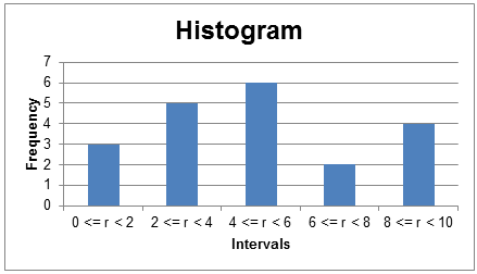
Histogram
The data in a frequency distribution can be presented using a histogram. A histogram is a bar chart with different intervals on the X-axis and the absolute frequencies on the Y-axis. The histogram for our data is presented below:
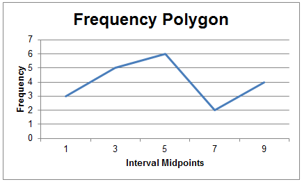
Frequency Polygon
A frequency polygon is similar to a histogram, except that the x-axis plots the mid-point for each interval. Instead of bars, the neighbouring points are connected by lines.
The interval mid points for our frequency intervals are 1, 3, 5, 7, and 9. The frequency polygon will look as follows: