Measure Model Performance in R Using ROCR Package
R’s ROCR package can be used for evaluating and visualizing the performance of classifiers / fitted models. It is helpful for estimating performance measures and plotting these measures over a range of cutoffs. (Note: the terms classifier and fitting model are used interchangeably)
The package features over 25 performance. The three important functions ‘prediction’, ‘performance’ and ‘plot' do most of the work. Let’s look at these functions and apply them to measure the performance of our model/classifier.
Prediction Object
The evaluation of a classifier starts with creating a prediction object using the prediction function. The format of the prediction function is:
1prediction(predictions, labels, label.ordering = NULL)
2
This function is used to transform the input data (which can be in vector, matrix, data frame, or list form) into a standardized format. The first parameter ‘predictions’ takes the predicted measure (usually continuous values) which we have predicted using the classifier. The second parameter ‘labels’ contains the ’truth’, i.e., the actual values for what we are predicting. In our example, in the test dataset, we calculated ‘predicted values’ for creditability using the model. These are the predictions. The test data set also contains the actual Creditability values. These are the labels.
Let’s create the prediction object.
1> install.packages("ROCR”)
2> library(ROCR)
3> pred <- prediction(predicted_values, credit_test$Creditability)
4
Performance Object
Using the prediction object, we can create the performance object, using the performance() function.
1performance(prediction.obj, measure, x.measure="cutoff", ...)
2
We see that the first argument is a prediction object, and the second is a measure. If you run ?performance, you can see all the performance measures implemented.
We will calculate and plot some commonly estimated measures: receiver operating characteristic (ROC) curves, accuracy, and area under the curve (AUC).
ROC Curve
A Receiver Operating Characteristic (ROC) curve is a graphical representation of the trade-off between the false negative and false positive rates for every possible cut off. By tradition, the plot shows the false positive rate (1-specificity) on the X-axis and the true positive rate (sensitivity or 1 - the false negative rate) on the Y axis.
Specificity and Sensitivity are the statistical measures of performance. Sensitivity also called the true positive rate measures the ratio of actual positives which are correctly identified as such (For example, % of people with good credit which are correctly identified as having good credit.) It is complimentary to the false negatives. Sensitivity = True Positives / (True Positives + False Negatives). Specificity, also called the true negative rate, measures the true negatives which are correctly identified as such. It is complimentary to false positive rate. Specificity=True Negatives / (True Negative + False Positives)
We will do a ROC curve, which plots the false positive rate (FPR) on the x-axis and the true positive rate (TPR) on the y-axis:
1> roc.perf = performance(pred, measure = "tpr", x.measure = "fpr")
2> plot(roc.perf)
3> abline(a=0, b= 1)
4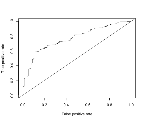
At every cutoff, the TPR and FPR are calculated and plotted. The smoother the graph, the more cutoffs the predictions have. We also plotted a 45-degree line, which represents, on average, the performance of a Uniform(0, 1) random variable. The further away from the diagonal line, the better. Overall, we see that we see gains in sensitivity (true positive rate, > 80%), trading off a false positive rate (1- specificity), up until about 15% FPR. After an FPR of 15%, we don't see significant gains in TPR for a tradeoff of increased FPR.
Area Under the Curve (AUC)
The area under curve (AUC) summarizes the ROC curve just by taking the area between the curve and the x-axis. Let's get the area under the curve for the simple predictions:
1auc.perf = performance(pred, measure = "auc")
2auc.perf@y.values
3[[1]]
4[1] 0.7694318
5>
6
The greater the AUC measure, the better our model is performing. As you can see, the result is a scalar number, the area under the curve (AUC). This number ranges from \(0\) to \(1\) with \(1\) indicating 100% specificity and 100% sensitivity.
The ROC of random guessing lies on the diagonal line. The ROC of a perfect diagnostic technique is a point at the upper left corner of the graph, where the TP proportion is 1.0 and the FP proportion is 0.
Accuracy
Another cost measure that is popular is overall accuracy. This measure optimizes the correct results, but may be skewed if there are many more negatives than positives, or vice versa. Let's get the overall accuracy for the simple predictions and plot it:
1acc.perf = performance(pred, measure = "acc")
2plot(acc.perf)
3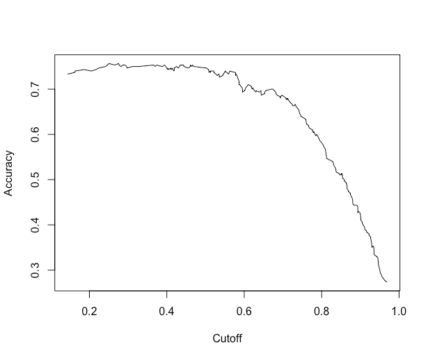
What if we actually want to extract the maximum accuracy and the cutoff corresponding to that? In the performanceobject, we have the slot x.values, which corresponds to the cutoff in this case, and y.values, which corresponds to the accuracy of each cutoff. We'll grab the index for maximum accuracy and then grab the corresponding cutoff:
1ind = which.max( slot(acc.perf, "y.values")[[1]] )
2acc = slot(acc.perf, "y.values")[[1]][ind]
3cutoff = slot(acc.perf, "x.values")[[1]][ind]
4> print(c(accuracy= acc, cutoff = cutoff))
5  accuracy cutoff.493
6 0.7566667  0.2755583
7>
8
Then you can go forth and threshold your model using the cutoff for (in hopes) maximum accuracy in your test data.
