Explore Loan Data in R - Loan Grade and Interest Rate
There is no set path to how one would go about analyzing a data set. Typically, a data scientist would spend quite some time exploring and observing the data to understand it well.
Let’s look at some of the attributes in our dataset and see their relationship with the default rate. For each loan, we have two basic attributes, namely, grade and the interest rate. In LendingClub, loan grade, or credit grade, is the letter (A-G or AA-HR) that is assigned to a borrower and corresponds with the interest rate that is charged for the loan.
These rates are set based on the originator’s underwriting assessment for the individual borrower. The higher the expected risk of default, the higher the interest rate is set in order to offset this risk. The assessment of the credit grade decision includes FICO, loan term (a shorter term is considered better), proprietary models, and the loan amount requested by the borrower.
We also have the interest rate being charged for each loan.
Default Rate for Each Loan Grade
Let’s create a plot where we will plot the default rate for each grade.
The following command will give us the number of defaults for each grade.
1> g1 = loandata %>% filter(loan_status == "Default") %>% group_by(grade) %>% summarise(default_count = n())
2> g1
3# A tibble: 7 x 2
4  grade default_count
5  <chr>         <int>
61 A               975
72 B              3487
83 C              5534
94 D              3697
105 E              2704
116 F              1260
127 G               379
13>
14
We can now calculate the default rate in each grade as follows:
1> g2 = loandata %>% group_by(grade) %>% summarise(count = n())
2> g3 <- g2 %>% left_join(g1) %>% mutate(default_rate = 100*default_count/count) %>% select(grade,count,default_count,default_rate)
3Joining, by = "grade"
4> g3
5# A tibble: 7 x 4
6  grade count default_count default_rate
7  <chr> <int>         <int>        <dbl>
81 A      9956           975         9.79
92 B     16649          3487        20.9
103 C     16815          5534        32.9
114 D      8480          3697        43.6
125 E      5261          2704        51.4
136 F      2109          1260        59.7
147 G       599           379        63.3
15>
16
We can now plot this using ggplot2.
1> ggplot(g3, aes(x=grade, y=default_rate, fill=grade)) + geom_bar(stat="identity")
2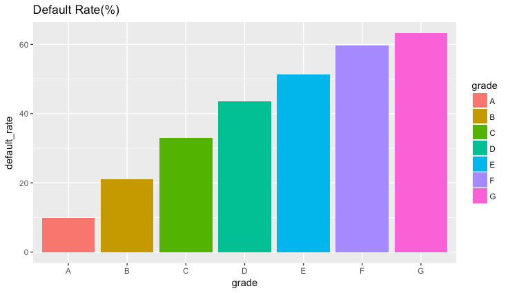
As we would expect, riskier loans have higher default rates.
Loan Grade Vs Interest Rate
We can also plot the relationship between Loan Grade and Interest Rate.
To do so, we will first convert the interest rate attribute to numeric.
1> loandata$int_rate = (as.numeric(gsub(pattern = "%",replacement = "",x = loandata$int_rate)))
2
We can now group the data by grade and their mean interest rates:
1> x1 = loandata %>% filter(loan_status == "Default") %>% group_by(grade) %>% summarise(int_rate=mean(int_rate))
21> ggplot(x1, aes(x=grade, y=int_rate, fill=grade)) + geom_bar(stat="identity",position="dodge")
2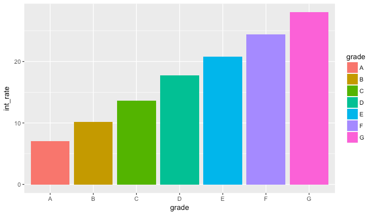
As we would expect, riskier loans (higher grades) have higher interest rates.
