Autocorrelation in R
Autocorrelation is an important part of time series analysis. It helps us understand how each observation in a time series is related to its recent past observations. When autocorrelation is high in a time series, it becomes easy to predict their future observations.
Let us consider the Microsoft stock prices for the year 2016, which we have as a time series object msft_ts. Below we have plotted the stock prices in the left chart and a scatter plot of the stock prices with a lag of 1 on the right hand side. We can clearly see a strong positive correlation between the two.
1> plot.ts(msft_ts,main="MSFT Stock Prices",ylab="Prices")
2> plot(msft_ts[-252],msft_ts[-1],main="Scatterplot (lag=1)")
3> abline(lm(msft_ts[-1] ~ msft_ts[-252]),col=4)
4>
5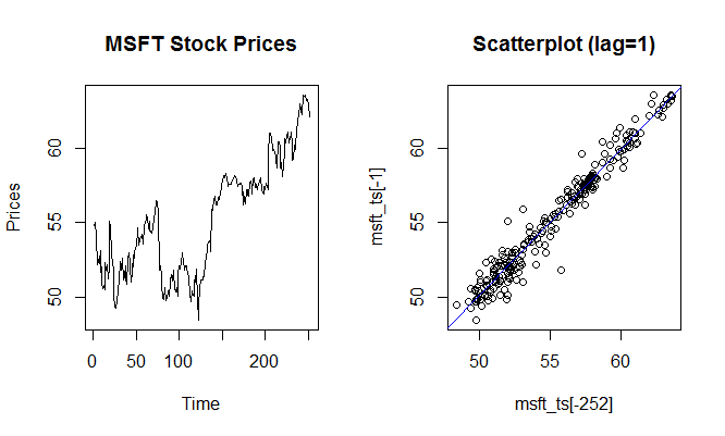
We can also calculate the correlation between the actual series and the lagged series using the cor() function in R.
1> #Correlation of stock price today and 1 day earlier
2> cor(msft_ts[-252],msft_ts[-1])
3[1] 0.9797061
4>
5
Similarly we can calculate the correlation with different lags, such as between the stock price today and the stock price two days earlier. In our example, the correlation between these two pairs is 0.9623, which is still quite high but less compared to the correlation with a time lag of 1.
1> cor(msft_ts[-(251:252)],msft_ts[-(1:2)])
2[1] 0.9623822
3>
4
ACF Function
Instead of calculating the correlation with each time lag manually, we can use the acf() function in R. The function acf computes (and by default plots) estimates of the autocovariance or autocorrelation function for different time lags.
Below we get the autocorrelations for lag 1 to 10. Notice that the correlation keeps reducing as the lag increases.
> acf(msft_ts, lag.max=10, plot=FALSE)
Autocorrelations of series msft_ts, by lag:
0 1 2 3 4 5 6 7 8 9 10 1.000 0.973 0.948 0.922 0.897 0.872 0.849 0.826 0.805 0.787 0.772
We can also get the same information in an acf plot as shown below. This is also called a correlogram, also known as an autocorrelation plot.
> acf(msft_ts, lag.max=10)
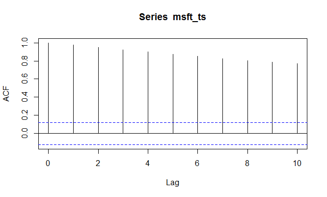
The x-axis donates the time lag, while the y-axis displays the estimated autocorrelation. Looking at this data, we can say that each observation is positively related to its recent past observations. However, the correlation decreases as the lag increases.
Exercise
Provided below is a csv file that contains the daily stock prices of 5 US stocks for 251 days. The five stocks are AAPL, MSFT, GOOG, IBM, and INTC.
- Load the data in R in a variable called
stock_data. - Extract only the AAPL stock prices in another variable called
aapl_prices. - Convert the
aapl_pricesinto a time series using thets()function. Store this in a variable calledaapl_prices_ts. - Calculate the autocorrelation in
aapl_prices_tswith 1 and 2 lags using thecor()function. - Use the acf function to find the autocorrelations in the
aapl_prices_tswith 1 to 10 time lags.
Why there is difference in the values of correlation coefficients with that of values given by acf. Lag 2 gives a value 0.962 while acf shows 0.948
The two estimates differ slightly as they use slightly different scalings in their calculation of sample covariance, 1/(n-l) in case of cor() versus 1/n in case of acf(). Even though the acf() method provides a biased estimate, it is preferred in time series analysis. The autocorrelation estimates differ by a factor of (n-l)/n.
