• Skip to primary navigation
  • Skip to main content
  • Skip to primary sidebar
  • Skip to footer
Finance Train

Finance Train

High Quality tutorials for finance, risk, data science

  • Home
  • Data Science
  • CFA® Exam
  • PRM Exam
  • Tutorials
  • Careers
  • Products
  • Login

What is a Box Plot and How to Read It

Data Science

This lesson is part 6 of 29 in the course Data Visualization with R

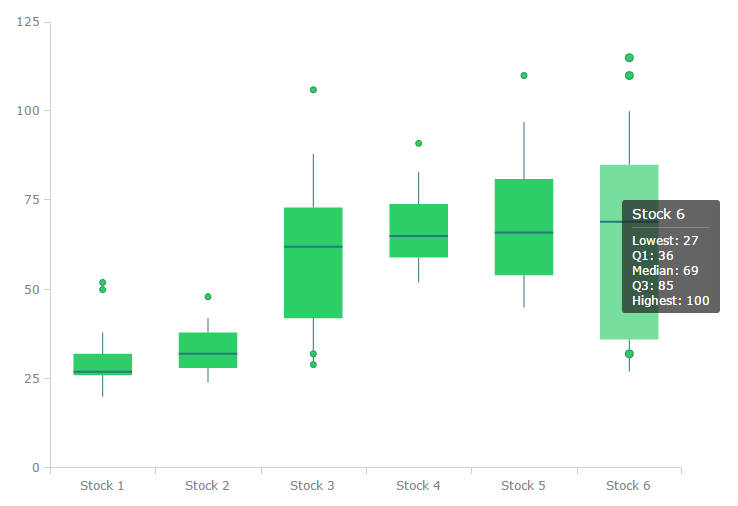
A Box Plot is a convenient way of graphically depicting groups of numerical data through their quartiles. They provide a graphical rendition of statistical data based on the minimum, first quartile, median, third quartile, and maximum, also Outliers can be plotted as individual points.

The term “box plot” comes from the fact that the graph looks like a rectangle with lines extending from the top and bottom. Because of the extending lines, this type of graph is sometimes called a box-and-whisker plot. The distances between the different box parts represent the degree of a data dispersion and a data asymmetry to identify outliers. The points values can be compared between themselves (single-series chart) or values inside the category (multi-series chart). In case of several series points are grouped by categories.

Box Plot

Interpreting a Box Plot

The box plot is interpretted as follows:

  • The box itself contains the middle 50% of the data. The upper edge (hinge) of the box indicates the 75th percentile of the data set, and the lower hinge indicates the 25th percentile. The range of the middle two quartiles is known as the inter-quartile range.
  • The line in the box indicates the median value of the data.
  • If the median line within the box is not equidistant from the hinges, then the data is skewed.
  • The ends of the vertical lines or “whiskers” indicate the minimum and maximum data values, unless outliers are present in which case the whiskers extend to a maximum of 1.5 times the inter-quartile range.
  • The points outside the ends of the whiskers are outliers or suspected outliers.
Previous Lesson

‹ How to Read Scatter Chart and Bubble Chart

Next Lesson

Understanding Japanese Candlestick Charts and OHLC Charts ›

Join Our Facebook Group - Finance, Risk and Data Science

Posts You May Like

How to Improve your Financial Health

CFA® Exam Overview and Guidelines (Updated for 2021)

Changing Themes (Look and Feel) in ggplot2 in R

Coordinates in ggplot2 in R

Facets for ggplot2 Charts in R (Faceting Layer)

Reader Interactions

Leave a Reply Cancel reply

Your email address will not be published. Required fields are marked *

This site uses Akismet to reduce spam. Learn how your comment data is processed.

Primary Sidebar

In this Course

  • Overview of Data Visualization
  • When to Use Bar Chart, Column Chart, and Area Chart
  • What is Line Chart and When to Use It
  • What are Pie Chart and Donut Chart and When to Use Them
  • How to Read Scatter Chart and Bubble Chart
  • What is a Box Plot and How to Read It
  • Understanding Japanese Candlestick Charts and OHLC Charts
  • Understanding Treemap, Heatmap and Other Map Charts
  • Visualization in Data Science
  • Graphic Systems in R
  • Accessing Built-in Datasets in R
  • How to Create a Scatter Plot in R
  • Create a Scatter Plot in R with Multiple Groups
  • Creating a Bar Chart in R
  • Creating a Line Chart in R
  • Plotting Multiple Datasets on One Chart in R
  • Adding Details and Features to R Plots
  • Introduction to ggplot2
  • Grammar of Graphics in ggplot
  • Data Import and Basic Manipulation in R – German Credit Dataset
  • Create ggplot Graph with German Credit Data in R
  • Splitting Plots with Facets in ggplots
  • ggplot2 – Chart Aesthetics and Position Adjustments in R
  • Creating a Line Chart in ggplot 2 in R
  • Add a Statistical Layer on Line Chart in ggplot2
  • stat_summary for Statistical Summary in ggplot2 R
  • Facets for ggplot2 Charts in R (Faceting Layer)
  • Coordinates in ggplot2 in R
  • Changing Themes (Look and Feel) in ggplot2 in R

Latest Tutorials

    • Data Visualization with R
    • Derivatives with R
    • Machine Learning in Finance Using Python
    • Credit Risk Modelling in R
    • Quantitative Trading Strategies in R
    • Financial Time Series Analysis in R
    • VaR Mapping
    • Option Valuation
    • Financial Reporting Standards
    • Fraud
Facebook Group

Membership

Unlock full access to Finance Train and see the entire library of member-only content and resources.

Subscribe

Footer

Recent Posts

  • How to Improve your Financial Health
  • CFA® Exam Overview and Guidelines (Updated for 2021)
  • Changing Themes (Look and Feel) in ggplot2 in R
  • Coordinates in ggplot2 in R
  • Facets for ggplot2 Charts in R (Faceting Layer)

Products

  • Level I Authority for CFA® Exam
  • CFA Level I Practice Questions
  • CFA Level I Mock Exam
  • Level II Question Bank for CFA® Exam
  • PRM Exam 1 Practice Question Bank
  • All Products

Quick Links

  • Privacy Policy
  • Contact Us

CFA Institute does not endorse, promote or warrant the accuracy or quality of Finance Train. CFA® and Chartered Financial Analyst® are registered trademarks owned by CFA Institute.

Copyright © 2021 Finance Train. All rights reserved.

  • About Us
  • Privacy Policy
  • Contact Us