stat_summary for Statistical Summary in ggplot2 R
stat_summary is a unique statistical function and allows a lot of flexibility in terms of specifying the summary. Using this, you can add a variety of summary on your plots. For example, in a bar chart, you can plot the bars based on a summary statistic such as mean or median. Similarly, stat_summary() can be used to add mean/median points to a dot plot.
stat_summary() takes a few different arguments.
fun.y: A function to produce y aestheticsfun.ymax: A function to produce ymax aestheticsfun.ymin: A function to produce ymin aestheticsfun.data: A function to produce a named vector of aesthetics
We can pass a function to each of these arguments, and ggplot2 will use the value returned by that function for the corresponding aesthetic. If you pass a function to fun.data, you can compute many summary statistics and return them as a vector, where each element in the vector is named for the aesthetic it should be used for.
Let's understand this with two examples:
Bar Chart with Median Values
We will use the stock_prices.tidy dataframe we created earlier to plot a bar chart with the stock symbols on the x-axis and the median stock price for each stock on y-axis. We can achieve this using the stat_summary() function as follows:
1ggplot(stock_prices.tidy,aes(x=Symbol,y=Prices,fill=Symbol))+
2  stat_summary(fun.y = median, geom = "bar")
3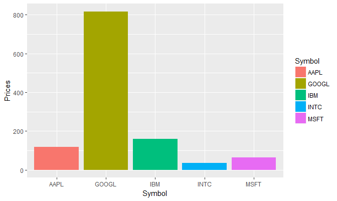
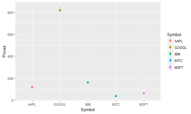
Quartile Points
Following is another example where we plot quartile points for each stock. We first create a new function to calculate the quartile and then supply that function as argument to fun.data in stat_summary().
1median.quartile <- function(x){
2  out <- quantile(x, probs = c(0.25,0.5,0.75))
3  names(out) <- c("ymin","y","ymax")
4  return(out)
5}
6ggplot(stock_prices.tidy, aes(x=Symbol,y=Prices,col=Symbol)) +
7  stat_summary(fun.data = median.quartile, geom = "pointrange")
8