• Skip to primary navigation
  • Skip to main content
  • Skip to primary sidebar
  • Skip to footer
Finance Train

Finance Train

High Quality tutorials for finance, risk, data science

  • Home
  • Data Science
  • CFA® Exam
  • PRM Exam
  • Tutorials
  • Careers
  • Products
  • Login

Splitting Plots with Facets in ggplots

Data Science

This lesson is part 22 of 29 in the course Data Visualization with R

Faceting refers to splitting the data into multiple subsets and then displaying plots for the specific subsets in a panel. Such plots are also called small-multiple plots. The facet approach partitions a plot into a matrix of panels. Each panel shows a different subset of the data.

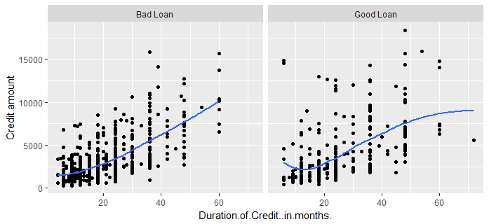
In our scatter plot we grouped the data into bad and good loans using colors. We can use the faceting concept to split the entire graph into two separate panels one for each, good and bad loans. To do so we will use the facet_grid(. ~ ___) layer. facet_grid forms a matrix of panels defined by row and column faceting variables. facet_grid(x ~ y) will display x*y plots even if some plots are empty.

g <- ggplot(df,aes(x=Duration.of.Credit..in.months.,y=Credit.amount))
g+geom_point()+geom_smooth(se=FALSE)+
  facet_grid(. ~ Loan.Quality)

We split our data only by columns. That’s why we specify the rows by a simple. The columns are split by Loan.Quality. Since this variable has only two values, the graph will be split into two columns.

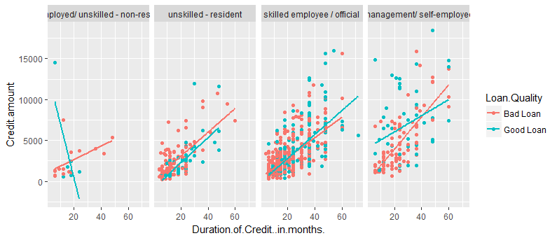
Faceting can be specially useful when we want to bring another variable into our plot. For example in this case, we can now add the Job variable to see how the type of job of the borrower impacts the credit.

g <- ggplot(df,aes(x=Duration.of.Credit..in.months.,y=Credit.amount, color=Job))
g+geom_point()+geom_smooth(se=FALSE,method='lm')+
  facet_grid(. ~ Loan.Quality)

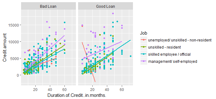
ggplot2 is beautiful and to slice the data in a different way is extremely easy. In the following graph, we exchange the two parameters Loan.Quality and Job.

g <- ggplot(df,aes(x=Duration.of.Credit..in.months.,y=Credit.amount, color=Loan.Quality))
g+geom_point()+geom_smooth(se=FALSE,method='lm')+
  facet_grid(. ~ Job)

Previous Lesson

‹ Create ggplot Graph with German Credit Data in R

Next Lesson

ggplot2 – Chart Aesthetics and Position Adjustments in R ›

Join Our Facebook Group - Finance, Risk and Data Science

Posts You May Like

How to Improve your Financial Health

CFA® Exam Overview and Guidelines (Updated for 2021)

Changing Themes (Look and Feel) in ggplot2 in R

Coordinates in ggplot2 in R

Facets for ggplot2 Charts in R (Faceting Layer)

Reader Interactions

Leave a Reply Cancel reply

Your email address will not be published. Required fields are marked *

This site uses Akismet to reduce spam. Learn how your comment data is processed.

Primary Sidebar

In this Course

  • Overview of Data Visualization
  • When to Use Bar Chart, Column Chart, and Area Chart
  • What is Line Chart and When to Use It
  • What are Pie Chart and Donut Chart and When to Use Them
  • How to Read Scatter Chart and Bubble Chart
  • What is a Box Plot and How to Read It
  • Understanding Japanese Candlestick Charts and OHLC Charts
  • Understanding Treemap, Heatmap and Other Map Charts
  • Visualization in Data Science
  • Graphic Systems in R
  • Accessing Built-in Datasets in R
  • How to Create a Scatter Plot in R
  • Create a Scatter Plot in R with Multiple Groups
  • Creating a Bar Chart in R
  • Creating a Line Chart in R
  • Plotting Multiple Datasets on One Chart in R
  • Adding Details and Features to R Plots
  • Introduction to ggplot2
  • Grammar of Graphics in ggplot
  • Data Import and Basic Manipulation in R – German Credit Dataset
  • Create ggplot Graph with German Credit Data in R
  • Splitting Plots with Facets in ggplots
  • ggplot2 – Chart Aesthetics and Position Adjustments in R
  • Creating a Line Chart in ggplot 2 in R
  • Add a Statistical Layer on Line Chart in ggplot2
  • stat_summary for Statistical Summary in ggplot2 R
  • Facets for ggplot2 Charts in R (Faceting Layer)
  • Coordinates in ggplot2 in R
  • Changing Themes (Look and Feel) in ggplot2 in R

Latest Tutorials

    • Data Visualization with R
    • Derivatives with R
    • Machine Learning in Finance Using Python
    • Credit Risk Modelling in R
    • Quantitative Trading Strategies in R
    • Financial Time Series Analysis in R
    • VaR Mapping
    • Option Valuation
    • Financial Reporting Standards
    • Fraud
Facebook Group

Membership

Unlock full access to Finance Train and see the entire library of member-only content and resources.

Subscribe

Footer

Recent Posts

  • How to Improve your Financial Health
  • CFA® Exam Overview and Guidelines (Updated for 2021)
  • Changing Themes (Look and Feel) in ggplot2 in R
  • Coordinates in ggplot2 in R
  • Facets for ggplot2 Charts in R (Faceting Layer)

Products

  • Level I Authority for CFA® Exam
  • CFA Level I Practice Questions
  • CFA Level I Mock Exam
  • Level II Question Bank for CFA® Exam
  • PRM Exam 1 Practice Question Bank
  • All Products

Quick Links

  • Privacy Policy
  • Contact Us

CFA Institute does not endorse, promote or warrant the accuracy or quality of Finance Train. CFA® and Chartered Financial Analyst® are registered trademarks owned by CFA Institute.

Copyright © 2021 Finance Train. All rights reserved.

  • About Us
  • Privacy Policy
  • Contact Us