Plotting Multiple Datasets on One Chart in R
It's a common scenario to plot multiple datasets together on a single graph. For example, we may want to plot the daily returns from multiple stocks on a single chart to understand how they trend vis-a-vis each other. Similarly, we may want to plot multiple normal distribution curves with different mean and standard deviations.
To plot multiple datasets, we first draw a graph with a single dataset using the plot() function. Then we add the second data set using the points() or lines() function.
Let's learn this with the help of an example where we will plot multiple normal distribution curves.
Generate x-axis data
First we will generate data for x-axis which will be a sequence of 200 evenly spaced numbers ranging from -5 to 5. We can do this using the seq() function in R.
> x<-seq(-5,5,length=200)
Calculate Values for Normal Distribution
We can do this in two ways: 1) Generate random numbers using rnorm() and then apply the density() function to the data. 2) Alternatively we can do this directly using the dnorm() function which gives the density of the distribution function. In more simple terms, this function gives height of the probability distribution at each point for a given mean and standard deviation. For our purpose, we will generate multiple datasets with different means and standard deviations.
1> y1<-dnorm(x,mean=0,sd=0.2)
2> y2=dnorm(x,mean=2,sd=0.5)
3> y3<-dnorm(x,mean=-2,sd=0.8)
4
Combine Datasets
We can also combine all the data into a single dataframe (optional).
> data<-data.frame(x,y1,y2,y3)
Plot the First Curve
1> plot(data$x,data$y1,type="l",main="Normal Distribution",xlab="x",ylab="y")
2
The plot looks as follows:
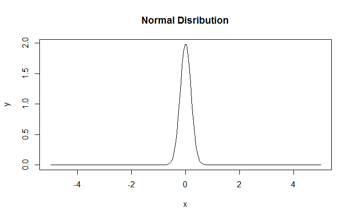
Normal Distribution
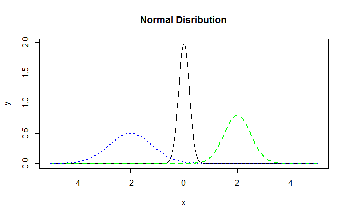
Add Lines for the Second Normal Density
We can now add the lines for the second and third density using the lines() function.
1> lines(data$x,data$y2,lty=2,lwd=2,col="green")
2> lines(data$x,data$y3,lty=3,lwd=2,col="blue")
3
The resulting graph is displayed below:
Note that if we were plotting just the scatter graph without lines, we could add more data points to it using the points() function instead of the lines() function.
Setting Canvas Size
Sometimes when we want to add multiple datasets to a single plot, it is important to correctly specify the size of the canvas. Let's say the first dataset that you plot has an x-value range of 0 to 100. Once this is plotted, the graph will draw the x-axis with the 0-100 range. However, assume now that the second dataset that you want to plot has x values ranging from 0 to 200. Since the initial plot doesn't consider this, the points from the second dataset will be plotted off the chart and will be cut-off. To correct this problem, we need to set the coordinates for the graph in the beginning itself. This can be done using the xlim and ylim arguments.
Suppose we want to plot two datasets (x1,y1) and (x2,y2). We can compute the limits using the range function and then set them using xlim and ylim.
1> xlim <- range(c(x1,x2))
2> ylim <- range(c(y1,y2))
3> plot(x1, y1, type="l", xlim=xlim, ylim=ylim)
4> lines(x2, y2, lty="dashed")
5