Introduction to ggplot2
We have already learned about how we can create meaningful data visualizations in R using the Base Graphics package. In this section, we will learn about how we can create even more powerful data graphics using an R package called ggplot2.
What is ggplot2?
The ggplot2 package is a very popular alternative to the base graphics package in R with over 1 million downloads in a year. At its core, it is an R package for creating statistical (data) graphics. However, it is different from other data visualization packages because it implements a very strong underlying grammar for creating these graphics. The ggplot2 package is an implementation of the ideas in the book, The Grammar of Graphics, by Leland Wilkinson, whose goal was to set out a set of general unifying principles for the visualization of data.
The package has very few base functions that makes it easy to learn and use. However, based on the grammar of graphics, we can combine these functions in many different ways to produce many different types of graphics. ggplot2 is also very good at setting reasonable default values enabling users to create good looking, hassle-free graphs. For example, it automatically adds legends to the graphs. Defaults enable us to use ggplot2 without knowing the grammar. However, knowing grammar allows us to build graphs from concepts rather than recall of commands and options. It also enables us to create new and improved graphs.
One of the important ideas in ggplot2 is that it allows us to build the graphic iteratively, one layer at a time. We can start with one layer that plots the raw data. Then add more layers showing annotations or statistical summaries. This matches with how we analyze data and think about data visualizations making it easy for use to create complex graphics iteratively.
Installation and Use
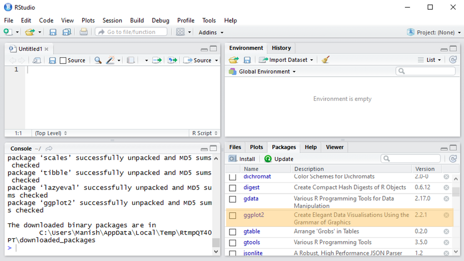
The first thing you need to do is install the ggplot2 package. This is done using the install.packages() function as shown below:
> install.packages("ggplot2")
This command will install the ggplot2 package in your R instance along with any dependency packages
If you're using RStudio, you will see the newly installed package listed under packages in the bottom right window.
Once installed you can load it in your current R session using the following command:
> library("ggplot2")
ggplot2 Documentation
- https://ggplot2.tidyverse.org/reference/
- Contains help files for most (all?) ggplot2 functions
- Help files typically contain numerous code and graphics examples
Plotting with ggplot2
ggplot2 offers two ways to to produce plot objects: 1) qplot() and 2) ggplot()
The qplot() (for quick plot) can be used to create the most common graph types. It hides much of the complexity when creating standard graphs.
The ggplot() function on the other hand brings the full power of grammar of graphics. It has slightly steeper learning curve but allows much more flexibility when building graphs
Our focus in this module will be on creating visualizations using the ggplot() function.
Example
The following example uses the Insurance dataset from the MASS package. Below we show a very basic graph created using the qplot() and ggplot() functions using this data. The data given in data frame Insurance consist of the numbers of policyholders of an insurance company who were exposed to risk, and the numbers of car insurance claims made by those policyholders in the third quarter of 1973. We plot a simple scatter chart with the No. of policy holders on x-axis and No. of claims on y-axis.
Since we're using the most basic settings, both the functions will produce the same chart.
Load the dataset
1> library(MASS)
2> data(Insurance)
3
Inspect data using the str() function
> str(Insurance)
Plot the chart using qplot() or ggplot()
Format in qplot()
> qplot(Insurance$Holders ,Insurance$Claims)
Format in ggplot()
1> ggplot(Insurance, aes(x = Holders, y = Claims))+geom_point()
2
Both these commands will draw the scatter plot with the Holders on x-axis and Claims on y-axis.

As you can see ggplot has automatically taken care of most of the details such as axis, legends, etc.
In the following lessons, we will learn about the grammar of graphics and use it to create interesting data visualizations on some financial datasets.
