How to Create a Scatter Plot in R
When you start analyzing a new dataset, your first requirement would be to know the variables in the dataset and the relationship between them. A scatter plot is the perfect place to start with. It is the quickest way to view the relationship between any two variables x and y.
You can create a scatter plot using the generic plot() function in R.
plot(x,y)
The function itself doesn't return anything back to the console but instead draws the plot in the plot window.
The two variables, x and y, could be two separate vectors or it could be a dataframe with two columns.
The following example shows the scatter plot created using the cars dataset. The data gives the speed of cars and the distances taken to stop. It has two columns, speed and dist. The first column, speed, becomes the x-axis and the second column, dist, becomes the y-axis.
plot(cars)
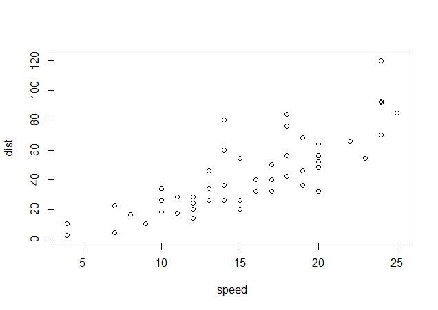
As you can see, the graph draws a point for each pair of speed and dist. The general observation from the scatter plot is that the higher the speed, the higher is the distance to stop.
If the dataset contains more than 2 columns, the plot() function will return multiple scatter plots each representing relationship between two variables.
Let's take another dataset called whiteside from the MASS package. The dataset contains home insulation data containing three variables, namely, Insul, Temp and Gas.
- Insul: A factor, before or after insulation.
- Temp: Purportedly the average outside temperature in degrees Celsius.
- Gas: The weekly gas consumption in 1000s of cubic feet.
If we call the plot() function on this dataset, it will plot multiple scatter plots representing relationship between all three variables.
1> #load the data
2> data(whiteside,package="MASS")
3> head(whiteside)
4   Insul Temp Gas
51 Before -0.8 7.2
62 Before -0.7 6.9
73 Before  0.4 6.4
84 Before  2.5 6.0
95 Before  2.9 5.8
106 Before  3.2 5.8
11> #plot the data
12> plot(whiteside)
13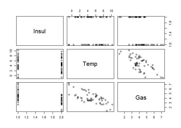
Each scatter plot draws points for two variables. For example, the graph in the lower left corner has Insul on x-axis and Gas on y-axis. Similarly, the graph in the bottom row, middle column has Temp on x-axis and Gas on y-axis.
The plot() function we use above is generic function, that is, it will change its behavior depending on the types of arguments provided and will produce different results. We just saw the use of the plot() function in its most basic form. In the following lessons, we will see how we can customize the plots and enhance them using various arguments.
Exercise
Load the Cars93 dataset from the MASS package and use the plot() function to draw scatter plots on its variables.
Enhancing a Plot
Now that we know how to create a basic plot using the plot() function, let's learn how we can enhance the chart in various ways. We will start with a new dataset which contains daily stock returns for five stocks, namely, Goldman Sachs, Citi, Apple, Facebook and JC Penny for a period of one year. The data is provided in csv format, so we will first load it into R.
Load the Data
I've placed the data file in my working directory and then used the read.csv() function to load the data into an R dataframe called 'stock_returns'.
1> getwd()
2[1] "C:/Users/Manish/Documents"
3> setwd("C:/r-programming/data")
4> getwd()
5[1] "C:/r-programming/data"
6> stock_returns <- read.csv("stock_returns.csv")
7> head(stock_returns)
8        Date    gs    c  aapl    fb   jcp
91 16/04/2015 -0.44 1.52 -0.48 -0.47 -2.69
102 15/04/2015  1.71 0.91  0.38 -0.98 -2.40
113 14/04/2015  1.09 0.13 -0.43  0.61 -2.66
124 13/04/2015 -0.03 0.44 -0.20  1.18  1.95
135 10/04/2015  0.38 0.58  0.43 -0.16  0.22
146 09/04/2015  1.21 0.46  0.76 -0.13  1.32
15
Create a Scatter Plot
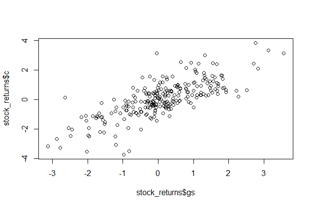
If we just call the plot() function on 'stock_returns' dataset, it will plot multiple scatter plots one for each pair of columns. However, for our use, we will just create a scatter plot for GoldmanSachs and Citi's stock returns. We can do so by supplying x and y values separately as shown below:
> plot(stock_returns$gs,stock_returns$c)
The resulting plot is shown below:
Add Title and Axis Labels
The scatter plot we created is quite plain. We can make it more readable by adding a title and labels to the X and Y axis. We will use the plot() function arguments to do so.
- The
mainargument for the title - The
xlabargument for the x-axis - The
ylabargument for the y-axis
After adding the title and labels, we can also add grid to the graph by calling the grid() function after calling the plot() function.
1> plot(stock_returns$gs,stock_returns$c, main="Scatter Plot: 1-year Daily Returns", xlab="GoldmanSachs Returns", ylab="Citigroup Returns")
2> grid()
3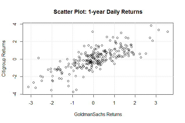
In the above example, we first plotted the graph and then added the grid to it. The alternative (and preferred) method is to plot the graph using the plot() function but with the argument type=n which will prevent the graph from printing. Then we call the grid() function to add the grid, and then finally call the low-level graphics function such as points() or lines() to overlay the graph on the grid.
Plot a Regression Line
We can add a regression line to this scatter plot of returns for GoldmanSachs and Citigroup as shown below:
1. Perform a linear regression using lm() on the two variables. lm stands for "linear model"
m <- lm(stock_returns$c ~ stock_returns$gs)
2. Draw the scatter plot
1plot(stock_returns$c ~ stock_returns$gs, main="Scatter Plot: 1-year Daily Returns", xlab="GoldmanSachs Returns", ylab="Citigroup Returns")
2
3. Add the regression line using abline function.
abline(m)
The graph will now look as follows:

Notice that we defined the plot as plot(stock_returns$c ~ stock_returns$gs). This is to keep the order of variables similar to how it is in the lm() function. The alternative way is plot(stock_returns$gs,stock_returns$c) that we used earlier.
Exercise
Load the 'stock_returns' dataset into R and create a scatter plot with Apple's returns on x-axis and Facebook's returns on y-axis. Then add a title, axis labels and a regression line to the plot.
