• Skip to primary navigation
  • Skip to main content
  • Skip to primary sidebar
  • Skip to footer
Finance Train

Finance Train

High Quality tutorials for finance, risk, data science

  • Home
  • Data Science
  • CFA® Exam
  • PRM Exam
  • Tutorials
  • Careers
  • Products
  • Login

Grammar of Graphics in ggplot

Data Science

This lesson is part 19 of 29 in the course Data Visualization with R

We know that the grammar of a language is a set of rules that explain how words are used in a language to form meaningful sentences. Similarly, grammar of graphics defines rules for structuring mathematics and aesthetic elements into a meaningful graph, i.e., graphics are built based on an underlying grammar.

The grammar of graphics in ggplot is a plotting framework developed by Leland Wilkinson in his book ‘Grammar of Graphics’ published in 1999.

There are two important principles here:

  1. Graphics are made of distinct layers of grammatical elements
  2. Plots are built with appropriate aesthetic mappings to makes these plots meaningful

In brief, the grammar tells us that a statistical graphic is a mapping from data to aesthetic attributes (colour, shape, size) of geometric objects (points, lines, bars). The plot may also contain statistical transformations of the data and is drawn on a specific coordinate system

From ggplot2 book

Components of Grammar of Graphics

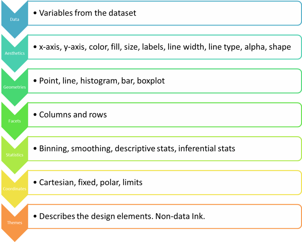
There are 7 grammatical elements in ggplot2 with 3 being essential. The following table summarizes these elements:

ElementDescription
DataThis is the dataset being plotted containing the variables to be plotted on the graph.This is an essential element.
AestheticsAesthetics refers to the scales on which we map our data. For example, we will map one variable to the x-axis, and another to y-axis. We may use to differentiate different attributes by color. Some common aesthetics to consider are axis, shape, size and color.This is an essential element.
GeometriesGeom refers to the actual visual elements used for the data in the plot, such as points, lines, and bars.
This is an essential element.
FacetsFaceting refers to splitting the data into multiple subsets and then displaying plots for the specific subsets in a panel. Such plots are also called small-multiple plots. The facet approach partitions a plot into a matrix of panels. Each panel shows a different subset of the data.This is an optional element.
StatisticsThis refers to representing statistical information about the data, such as mean and variance, to help in understanding the data.This is an optional element.
CoordinatesThis refers to the space on which the data is plotted (E.g., Cartesian coordinates). Most popular graphs such as line and bar charts are drawn using Cartesian coordinates.
This is an optional element.
ThemesThemes are used to change the appearance of non-data elements. Themes enable you to design with a particular visual identity using fonts, colours and other design elements.This is an optional element.
7 grammatical elements in ggplot2

It is useful to think of plots made up of layers. A layer can be thought of as consisting of the data, a mapping of data to aesthetics, and a geometry to visually display the data. Sometimes you can also use additional parameters to customize the display.

The grammar of graphics is implemented in R using the ggplot2 package. Essentially we develop plots by layering graphical elements on top of each other and use aesthetic mappings to refine our visualizations.

The following diagram provides an Ariel view of choices we will make while defining each layer in a plot. So, when we are making a plot with ggplot2, we are making choices from these items (Note: These are examples of choices. there are more choices that are not shown.)

In the next few lessons, we will learn about how we can create a variety of meaningful data visualizations using ggplot2 by implementing these 7 layers of grammar of graphics.

Previous Lesson

‹ Introduction to ggplot2

Next Lesson

Data Import and Basic Manipulation in R – German Credit Dataset ›

Join Our Facebook Group - Finance, Risk and Data Science

Posts You May Like

How to Improve your Financial Health

CFA® Exam Overview and Guidelines (Updated for 2021)

Changing Themes (Look and Feel) in ggplot2 in R

Coordinates in ggplot2 in R

Facets for ggplot2 Charts in R (Faceting Layer)

Reader Interactions

Leave a Reply Cancel reply

Your email address will not be published. Required fields are marked *

This site uses Akismet to reduce spam. Learn how your comment data is processed.

Primary Sidebar

In this Course

  • Overview of Data Visualization
  • When to Use Bar Chart, Column Chart, and Area Chart
  • What is Line Chart and When to Use It
  • What are Pie Chart and Donut Chart and When to Use Them
  • How to Read Scatter Chart and Bubble Chart
  • What is a Box Plot and How to Read It
  • Understanding Japanese Candlestick Charts and OHLC Charts
  • Understanding Treemap, Heatmap and Other Map Charts
  • Visualization in Data Science
  • Graphic Systems in R
  • Accessing Built-in Datasets in R
  • How to Create a Scatter Plot in R
  • Create a Scatter Plot in R with Multiple Groups
  • Creating a Bar Chart in R
  • Creating a Line Chart in R
  • Plotting Multiple Datasets on One Chart in R
  • Adding Details and Features to R Plots
  • Introduction to ggplot2
  • Grammar of Graphics in ggplot
  • Data Import and Basic Manipulation in R – German Credit Dataset
  • Create ggplot Graph with German Credit Data in R
  • Splitting Plots with Facets in ggplots
  • ggplot2 – Chart Aesthetics and Position Adjustments in R
  • Creating a Line Chart in ggplot 2 in R
  • Add a Statistical Layer on Line Chart in ggplot2
  • stat_summary for Statistical Summary in ggplot2 R
  • Facets for ggplot2 Charts in R (Faceting Layer)
  • Coordinates in ggplot2 in R
  • Changing Themes (Look and Feel) in ggplot2 in R

Latest Tutorials

    • Data Visualization with R
    • Derivatives with R
    • Machine Learning in Finance Using Python
    • Credit Risk Modelling in R
    • Quantitative Trading Strategies in R
    • Financial Time Series Analysis in R
    • VaR Mapping
    • Option Valuation
    • Financial Reporting Standards
    • Fraud
Facebook Group

Membership

Unlock full access to Finance Train and see the entire library of member-only content and resources.

Subscribe

Footer

Recent Posts

  • How to Improve your Financial Health
  • CFA® Exam Overview and Guidelines (Updated for 2021)
  • Changing Themes (Look and Feel) in ggplot2 in R
  • Coordinates in ggplot2 in R
  • Facets for ggplot2 Charts in R (Faceting Layer)

Products

  • Level I Authority for CFA® Exam
  • CFA Level I Practice Questions
  • CFA Level I Mock Exam
  • Level II Question Bank for CFA® Exam
  • PRM Exam 1 Practice Question Bank
  • All Products

Quick Links

  • Privacy Policy
  • Contact Us

CFA Institute does not endorse, promote or warrant the accuracy or quality of Finance Train. CFA® and Chartered Financial Analyst® are registered trademarks owned by CFA Institute.

Copyright © 2021 Finance Train. All rights reserved.

  • About Us
  • Privacy Policy
  • Contact Us