ggplot2 - Chart Aesthetics and Position Adjustments in R
ggplot2 - Aestheitics
Generally when we talk about aesthetics, we talk about the attributes of a chart such as the color, size and shape. However, in ggplot2, it is not just about how something looks but also about how a variable is mapped it to. In our earlier examples, we mapped the Loan.Quality to Color. As a part of the Aesthetics layer, we map variables to aesthetics. This includes a variety of things such as the x-position, y-position, color, fill and so on. So, when we want to plot Credit Amount on y-axis, we are essentially mapping the variable Credit.Amount to y axis.
The following is a list of various aesthetics that we can specify.
Let's take an example and try out these aesthetics. We will use the German Credit Data and create a scatter plot with custom aesthetics.
- Map Credit.amount on x-axis
- Map Duration.of.Credit..in.months. on y-axis
- Change shape to 21 (filled circle with outline). Use ?shape to learn about different shapes available.
- Map the Loan.Quality to fill
- Change the shape size to 3
- Reduce alpha to 0.5
- Add a plot title - "Loan Amount Vs Duration"
- Change x-axis label to "Loan Amount"
- Change y-axis label to "Duration in Months"
I suggest that you try doing this yourself in your R environment and if things don't work out, use the code provided below:
1g <- ggplot(df,aes(x=Credit.amount,y=Duration.of.Credit..in.months.,fill=Loan.Quality))
2g+geom_point(shape=21,size=3,alpha=0.5)
3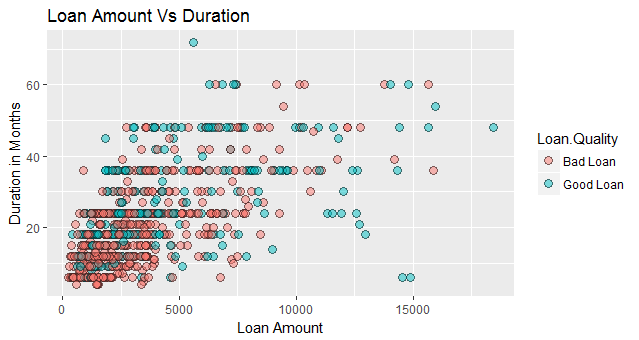
Let's plot one more graph and we will also make use of facets to split the data into multiple plots.
- Map Job to x-axis
- Map Credit.amount to y-axis
- May Job to color so that each job category has a different color.
- Add jitter to the data. Jittering refers to purposely adding noise to your data. This will be helpful here because on x-axis we have a category. If we simply plot the points they will all be in one line
- Change alpha to 0.5
- Change size to 3
The following code achieves this:
1g <- ggplot(df,aes(x=Job,y=Credit.amount,color=Job))
2g+geom_jitter(size=2,alpha=0.5)+
3labs(title ="Loan Amount by Job", x = "Job", y = "Loan Amount")
4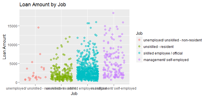
The way ggplot2 is designed is that you can customize almost anything in the chart and achieve exactly what you want.
ggplot2 - Position Adjustments
ggplot2 allows us to adjust the position of each geom. To do so, we simply have to specify the desired position to the position argument of the geom function. In the previous lesson, we saw jittering, which is an example of position adjustment of continuous data.
We have the following position adjustments available:
position_identity- This is the default for most geoms. This just means don't adjust position. So we are telling ggplot2 to plot the data as it is.position_jitter- This allows us to add noise to the plot which may be hard to read because of multiple overlapping points. We can specify width and height as arguments -position_jitter(width = NULL, height = NULL)position_dodge- Dodging preserves the vertical position of a geom while adjusting the horizontal position. Format:.1position_dodge(width = NULL, preserve = c("total", "single"))position_stack- Stacks bars on to of each other. This is the default ofgeom_barandgeom_areaposition_fill- stacks bars and standardizes each stack to have constant height
geom_bar in ggplot2
Let's learn about position adjustments using geom_bar in ggplot2. We will use our German Credit dataset.
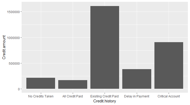
Simple Bar Chart
We will start by plotting a simple bar chart with the borrower's Credit History on x-axis and the amount of loan taken on y-axis.
1p <- ggplot(data=df, aes(x=Credit.history, y=Credit.amount)) +
2  geom_bar(stat="identity")
3p
4
This will produce the following chart:
Add Colors to Bars
To add colors to the bars, we can supply the x dimension to the fill argument (fill = Credit.history). ggplot2 will assign a color to each value in Credit.history and fill the bars with that color.
1p <- ggplot(data=df, aes(x=Credit.history, y=Credit.amount, fill=Credit.history )) +
2  geom_bar(stat="identity")
3p
4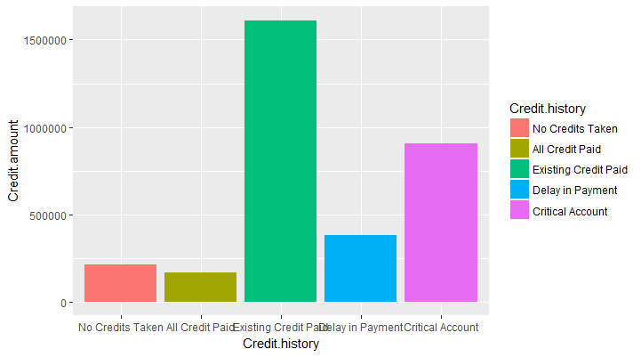
Stacked Bars
We can also group the data by a third variable such as Loan.Quality. By default it will split the data by that variable and plot a stacked bar chart. This is done by mapping the variable Loan.Quality to the fill scale. position_stack is the default argument for geom_bar
1p <- ggplot(data=df, aes(x=Credit.history, y=Credit.amount, fill=Loan.Quality )) +
2  geom_bar(stat="identity")
3p
4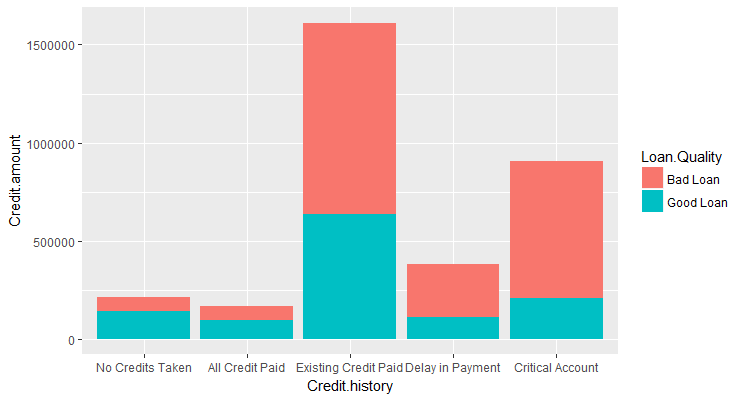
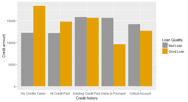
Dodging
If we did not want the bars to be stacked we can use position_dodge which will preserve the vertical position of the geom while adjusting the horizontal position.
1p <- ggplot(data=df, aes(x=Credit.history, y=Credit.amount, fill=Loan.Quality )) +
2  geom_bar(stat="identity",position=position_dodge())
3p
4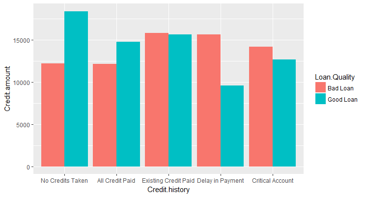
100% Stacked Bar
We can use the argument position_fill to change it into a 100% stacked bar chart which is useful for relative comparison.
1p <- ggplot(data=df, aes(x=Credit.history, y=Credit.amount, fill=Loan.Quality )) +
2  geom_bar(stat="identity",position=position_fill())
3p
4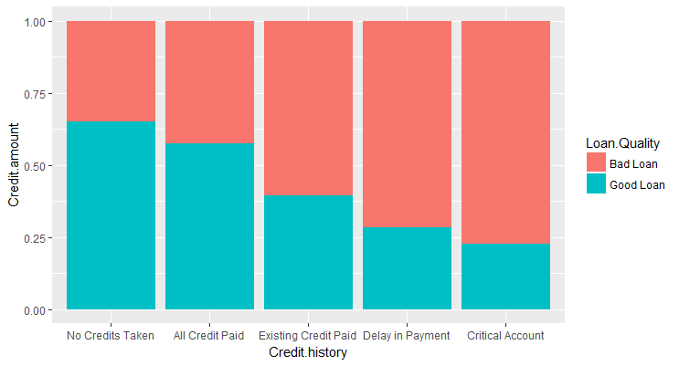
Modifying Scales
In ggplot2, each aesthetic is a scale which we map our data on to. So, color is just a scale just like x and y axis. We can access and modify each scale using the "scale_" functions. For example, we can use scale_fill_manual to manually specify the colors to be used in the plot as shown in the plot below: