Creating Charts with Quantmod
Apart from loading data from external and local sources, Quantmod is also suitable for making beautiful charts. There are three types of charts: lines, bars and candlestick. We will learn how to create these charts to show historical data for SPY index. In Quantmod, the function to create charts is called chartSeries. With the type parameter we can change the chart type.
1# Use the chartSeries() function to create charts. With the type parameter we can change the chart type.
2
3chartSeries(SPY, type="line")
4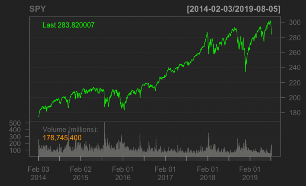
We can also subset the graph for a certain period using the subset parameter. The following command produces a candlestick chart only for the 2019 data.
1chartSeries(SPY,  type="candlestick", subset='2019')
2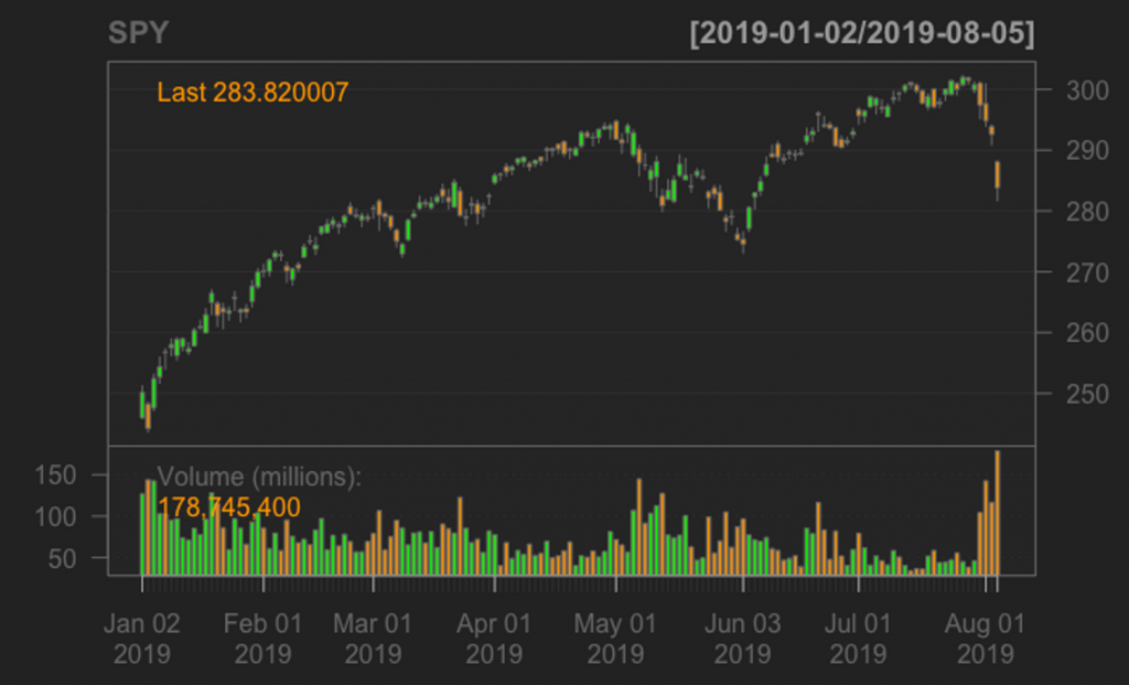
Adding Technical Indicators with Quantmod
The Quantmod package provides built in technical indicators that can be included in the charts. We will now see how to calculate technical indicators with Quantmod for the SPY index and finally, create an R dataframe with the close prices and the technical indicators as columns.
1#### Calculates Indicators: EMA,RSI, ADX, STOCHASTIC, ATR
2
3EMA <- round(EMA(Cl(SPY),n=14),3)
4RSI <- round(RSI(Cl(SPY),n=14),3)
5ADX <- round(ADX(HLC(SPY),n=14),3)
6ATR <- round(ATR(HLC(SPY),n=14),3)
7STOCH <- round(stoch(HLC(SPY)),3) * 100
8
9# At this point it will be a good idea to explore these objects and view the data contained.
10# You can use commands such as dim(), head(), and tail() to do this.
11
12# Combine the required indicators into a single data table.
13
14spyIndicators <- data.frame(cbind(Cl(SPY),RSI,ADX$ADX,ATR$atr,STOCH$fastK,STOCH$fastD))
15
16# Add custom column names for each column
17
18colnames(spyIndicators) <- c('SPY','RSI','ADX','ATR','KLine','DLine')
19
20# View last 15 rows of the data to get a feel of the data
21tail(spyIndicators,15) # shows the last 15 rows of the data
22
23 SPY RSI ADX ATR KLine DLine
242019-05-15 285.06 44.151 26.221 3.617 34.2 21.1
252019-05-16 287.70 49.858 24.589 3.655 51.7 36.3
262019-05-17 285.84 46.270 22.850 3.642 39.3 41.7
272019-05-20 283.95 42.893 21.863 3.585 26.8 39.3
282019-05-21 286.51 48.388 20.588 3.542 45.7 37.3
292019-05-22 285.63 46.724 19.558 3.402 39.6 37.3
302019-05-23 282.14 40.739 19.917 3.521 16.5 33.9
312019-05-24 282.78 42.201 19.857 3.420 26.2 27.4
322019-05-28 280.15 38.047 20.298 3.463 2.3 15.0
332019-05-29 278.27 35.367 21.444 3.461 12.5 13.7
342019-05-30 279.03 37.290 22.225 3.373 18.6 11.1
352019-05-31 275.27 32.187 23.460 3.403 0.2 10.4
362019-06-03 274.57 31.328 24.981 3.407 9.2 9.3
372019-06-04 280.53 44.834 24.821 3.600 46.2 18.5
382019-06-05 282.96 49.220 23.937 3.534 61.2 38.9
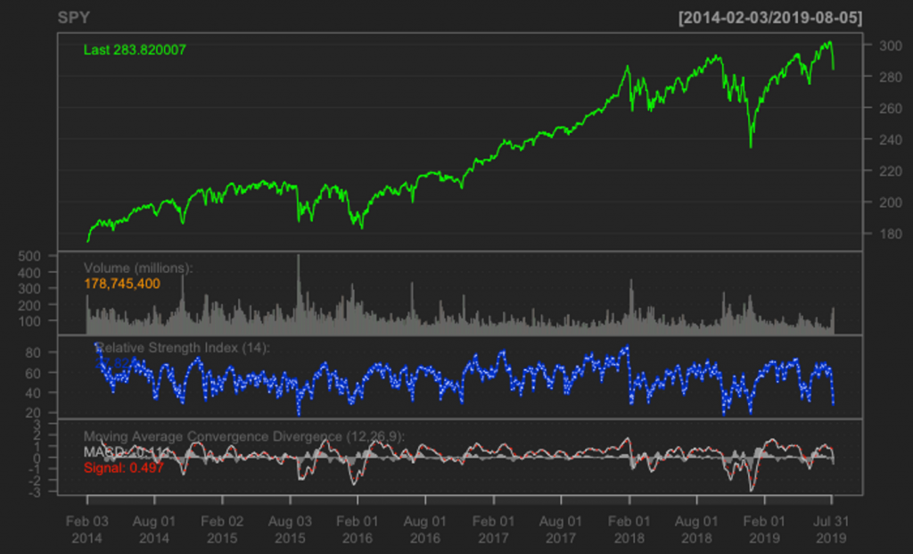
39Add Indicators to Charts
In order to add technical indicators in a chart, Quantmod provides the add{IndicatorName)() function. We will use this function for plotting the RSI and the MACD of SPY prices. Both indicators are plotted with the default parameters which are specified below:
1### Charting with Technical Indicators
2
3chartSeries(SPY,type="line")
4addRSI(n=14,maType="EMA")
5addMACD(fast=12,slow=26,signal=9,type='EMA',histogram = TRUE)
6