• Skip to primary navigation
  • Skip to main content
  • Skip to primary sidebar
  • Skip to footer
Finance Train

Finance Train

High Quality tutorials for finance, risk, data science

  • Home
  • Data Science
  • CFA® Exam
  • PRM Exam
  • Tutorials
  • Careers
  • Products
  • Login

Create ggplot Graph with German Credit Data in R

Data Science

This lesson is part 21 of 29 in the course Data Visualization with R

In ggplot2 package, we use the ggplot() function to create a fully customized data visualization. We still have the German credit data loaded in the dataframe df.

We will start by plotting a simple scatter graph that plots the duration of credit on x-axis and the amount of credit on y-axis. We can do so using the following command.

> ggplot(df,aes(x=Duration.of.Credit..in.months.,y=Credit.amount))

or 

g <- ggplot(df,aes(x=Duration.of.Credit..in.months.,y=Credit.amount))

The process of creating a graph starts with the ggplot() function. Note that we can either directly issue the command which will print the graph or we can create an object by assigning the function to a variable. In the 2nd example above, we have created an R object called g that stores the graph object.

The above command uses only the first two levels of the grammar of graphics, i.e., data and aesthetics. If we print this, it will only print an empty graph, as shown below:

We use the third level, that is, geom (geometric object) to print the actual data on the graph. Geometric objects are the actual marks we put on a plot.

  • points (geom_point, for scatter plots, dot plots, etc)
  • lines (geom_line, for time series, trend lines, etc)
  • boxplot (geom_boxplot, for, well, boxplots!)

We use geom_points to create scatter plots, geom_bar for bar chart and so on. A plot must have at least one geom; there is no upper limit. You can add a geom to a plot using the + operator.

You can get a list of available geometric objects using the code below:

help.search("geom_", package = "ggplot2")

Points (Scatterplot)

We now know the data that we want to plot, the aesthetics, and the geometric object that we want to create. We can use this information to complete our scatter plot.

We will add the points geom to our graph object g, as shown below:

> g <- ggplot(df,aes(x=Duration.of.Credit..in.months.,y=Credit.amount))
> g + geom_point()

The scatter plot will be created as shown below:

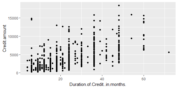
The above scatter plot shows the relationship between the duration of credit in months and the amount loan. Each point represents a loan. In our dataset, we have 1000 loans and we also know that each loan has either defaulted or not. This is represented in the data point Loan.Quality. We can use this variable to improve this graph, for example, by coloring the points based on the loan quality.

However, there is one small problem here. The variable Loan.Quality is of type integer (1 for Bad Loan, and 2 for Good Loan). So, to use to to categorize data, we can convert it to Factor and then add levels.

#Convert Loan.Quality to Factor
df$Loan.Quality <- as.factor(df$Loan.Quality)
#Add levels for data points
levels(df$Loan.Quality) <- c("Bad Loan", "Good Loan")

We can now use this variable to color the points. For this we will add the parameter color to aesthetics.

> g <- ggplot(df,aes(x=Duration.of.Credit..in.months.,y=Credit.amount))
> g+geom_point(aes(color=Loan.Quality))

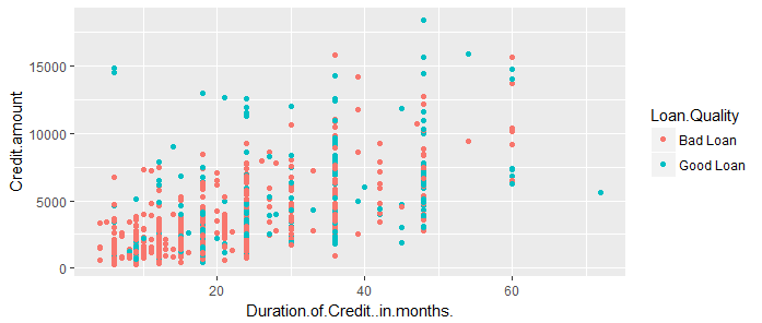
As you can see, the points in the scatter plot are of two colors, red for bad loans, and blue for good loans. ggplot2 has automatically selected the colors and also added the legend for convenience.

Previous Lesson

‹ Data Import and Basic Manipulation in R – German Credit Dataset

Next Lesson

Splitting Plots with Facets in ggplots ›

Join Our Facebook Group - Finance, Risk and Data Science

Posts You May Like

How to Improve your Financial Health

CFA® Exam Overview and Guidelines (Updated for 2021)

Changing Themes (Look and Feel) in ggplot2 in R

Coordinates in ggplot2 in R

Facets for ggplot2 Charts in R (Faceting Layer)

Reader Interactions

Leave a Reply Cancel reply

Your email address will not be published. Required fields are marked *

This site uses Akismet to reduce spam. Learn how your comment data is processed.

Primary Sidebar

In this Course

  • Overview of Data Visualization
  • When to Use Bar Chart, Column Chart, and Area Chart
  • What is Line Chart and When to Use It
  • What are Pie Chart and Donut Chart and When to Use Them
  • How to Read Scatter Chart and Bubble Chart
  • What is a Box Plot and How to Read It
  • Understanding Japanese Candlestick Charts and OHLC Charts
  • Understanding Treemap, Heatmap and Other Map Charts
  • Visualization in Data Science
  • Graphic Systems in R
  • Accessing Built-in Datasets in R
  • How to Create a Scatter Plot in R
  • Create a Scatter Plot in R with Multiple Groups
  • Creating a Bar Chart in R
  • Creating a Line Chart in R
  • Plotting Multiple Datasets on One Chart in R
  • Adding Details and Features to R Plots
  • Introduction to ggplot2
  • Grammar of Graphics in ggplot
  • Data Import and Basic Manipulation in R – German Credit Dataset
  • Create ggplot Graph with German Credit Data in R
  • Splitting Plots with Facets in ggplots
  • ggplot2 – Chart Aesthetics and Position Adjustments in R
  • Creating a Line Chart in ggplot 2 in R
  • Add a Statistical Layer on Line Chart in ggplot2
  • stat_summary for Statistical Summary in ggplot2 R
  • Facets for ggplot2 Charts in R (Faceting Layer)
  • Coordinates in ggplot2 in R
  • Changing Themes (Look and Feel) in ggplot2 in R

Latest Tutorials

    • Data Visualization with R
    • Derivatives with R
    • Machine Learning in Finance Using Python
    • Credit Risk Modelling in R
    • Quantitative Trading Strategies in R
    • Financial Time Series Analysis in R
    • VaR Mapping
    • Option Valuation
    • Financial Reporting Standards
    • Fraud
Facebook Group

Membership

Unlock full access to Finance Train and see the entire library of member-only content and resources.

Subscribe

Footer

Recent Posts

  • How to Improve your Financial Health
  • CFA® Exam Overview and Guidelines (Updated for 2021)
  • Changing Themes (Look and Feel) in ggplot2 in R
  • Coordinates in ggplot2 in R
  • Facets for ggplot2 Charts in R (Faceting Layer)

Products

  • Level I Authority for CFA® Exam
  • CFA Level I Practice Questions
  • CFA Level I Mock Exam
  • Level II Question Bank for CFA® Exam
  • PRM Exam 1 Practice Question Bank
  • All Products

Quick Links

  • Privacy Policy
  • Contact Us

CFA Institute does not endorse, promote or warrant the accuracy or quality of Finance Train. CFA® and Chartered Financial Analyst® are registered trademarks owned by CFA Institute.

Copyright © 2021 Finance Train. All rights reserved.

  • About Us
  • Privacy Policy
  • Contact Us