• Skip to primary navigation
  • Skip to main content
  • Skip to primary sidebar
  • Skip to footer
Finance Train

Finance Train

High Quality tutorials for finance, risk, data science

  • Home
  • Data Science
  • CFA® Exam
  • PRM Exam
  • Tutorials
  • Careers
  • Products
  • Login

Create a Scatter Plot in R with Multiple Groups

Data Science

This lesson is part 13 of 29 in the course Data Visualization with R

Let’s say you have Sales Orders data for a sports equipment manufacturer and you want to plot the Revenue and Gross Margins on a scatter plot. However, you also have a ProductLine column that contains information about the product category and you want to distinguish the x,y points by the ProductLine.

We can do so using the pch argument of the plot function.

> plot(x, y, pch=as.integer(f))

By specifying this option, the plot will use a different plotting symbol for each point based on its group (f).

We have created a sample dataset for this lesson which contains Sales, Gross Margin, ProductLine and some more factor columns. You can download this dataset from the Lesson Resources section. As always, we will first load the dataset into an R dataframe.

Sales_ProductsDownload
> setwd("C:/r-programming/data")
> getwd()
> sales<-read.csv("Sales_Products.csv")

Before plotting the graph, it’s a good idea to learn more about the data by using the summary() and head() functions.

We are interested in three columns from this dataset:

  • Revenue: The total revenue from each order. We will plot this on x-axis.
  • Gross Margin: The gross margin from each order. We will plot this on y-axis.
  • ProductLine: The product category. We will group the data by ProductLine.

We can now draw the scatter plot using the following command:

plot(sales$Revenue,sales$GrossMargin,pch=as.integer(sales$ProductLine))

The result is displayed below. You can clearly see the points with different symbols according to their group.

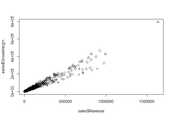
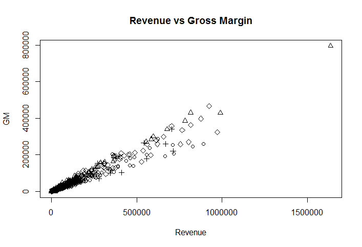
Notice that R has converted the y-axis scale values to scientific notation. We can correct this by changing the option scipen to a higher value. This controls which numbers are printed in scientific notation.

> options("scipen" = 10)
> options()$scipen
[1] 10

If you plot the chart again, the numbers would display correctly.

Add a Legend

Now that we have different symbols being used for different groups, we can make the graph even more convenient by adding a legend to it. We can do so by calling the legend function after the plot function.

legend(x, y=NULL, legend, …)

x, y are the coordinates for the legend box. There are two ways to specify x: 1) Specify the position by using “topleft”, “topright”, etc. 2) Use an x-coordinate for the top-left corner of the legend. If you choose option 1 for specifying x, then y can be skipped. Alternatively you need to specify the y-coordinate for the top-left corner of the legend.

The third argument “legend” is a vector of the character strings to appear in the legend.

You also need to specify a fourth argument that varies depending on what you’re labeling. You can create legends for points, lines, and colors. In our case, we are creating legend for points, so we will provide the forth argument pch which is also a vector indicating that we are labeling the points by their type.

> legend("topleft", c("Camping Equipment","Golf Equipment","Mountaineering Equipment", "Outdoor Protection", "Personal Accessories"), pch=1:5)

The graph will now look as follows:

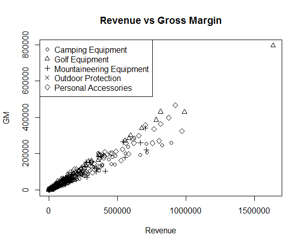
The legend function can also create legends for colors, fills, and line widths.The legend() function takes many arguments and you can learn more about it using help by typing ?legend.

Exercise

  • Download and load the Sales_Products dataset in your R environment
  • Use the summary() function to explore the data
  • Create a scatter plot for Sales and Gross Margin and group the points by OrderMethod
  • Add a legend to the scatter plot
  • Add different colors to the points based on their group. (Hint: Use the col argument in the plot() function
Previous Lesson

‹ How to Create a Scatter Plot in R

Next Lesson

Creating a Bar Chart in R ›

Join Our Facebook Group - Finance, Risk and Data Science

Posts You May Like

How to Improve your Financial Health

CFA® Exam Overview and Guidelines (Updated for 2021)

Changing Themes (Look and Feel) in ggplot2 in R

Coordinates in ggplot2 in R

Facets for ggplot2 Charts in R (Faceting Layer)

Reader Interactions

Leave a Reply Cancel reply

Your email address will not be published. Required fields are marked *

This site uses Akismet to reduce spam. Learn how your comment data is processed.

Primary Sidebar

In this Course

  • Overview of Data Visualization
  • When to Use Bar Chart, Column Chart, and Area Chart
  • What is Line Chart and When to Use It
  • What are Pie Chart and Donut Chart and When to Use Them
  • How to Read Scatter Chart and Bubble Chart
  • What is a Box Plot and How to Read It
  • Understanding Japanese Candlestick Charts and OHLC Charts
  • Understanding Treemap, Heatmap and Other Map Charts
  • Visualization in Data Science
  • Graphic Systems in R
  • Accessing Built-in Datasets in R
  • How to Create a Scatter Plot in R
  • Create a Scatter Plot in R with Multiple Groups
  • Creating a Bar Chart in R
  • Creating a Line Chart in R
  • Plotting Multiple Datasets on One Chart in R
  • Adding Details and Features to R Plots
  • Introduction to ggplot2
  • Grammar of Graphics in ggplot
  • Data Import and Basic Manipulation in R – German Credit Dataset
  • Create ggplot Graph with German Credit Data in R
  • Splitting Plots with Facets in ggplots
  • ggplot2 – Chart Aesthetics and Position Adjustments in R
  • Creating a Line Chart in ggplot 2 in R
  • Add a Statistical Layer on Line Chart in ggplot2
  • stat_summary for Statistical Summary in ggplot2 R
  • Facets for ggplot2 Charts in R (Faceting Layer)
  • Coordinates in ggplot2 in R
  • Changing Themes (Look and Feel) in ggplot2 in R

Latest Tutorials

    • Data Visualization with R
    • Derivatives with R
    • Machine Learning in Finance Using Python
    • Credit Risk Modelling in R
    • Quantitative Trading Strategies in R
    • Financial Time Series Analysis in R
    • VaR Mapping
    • Option Valuation
    • Financial Reporting Standards
    • Fraud
Facebook Group

Membership

Unlock full access to Finance Train and see the entire library of member-only content and resources.

Subscribe

Footer

Recent Posts

  • How to Improve your Financial Health
  • CFA® Exam Overview and Guidelines (Updated for 2021)
  • Changing Themes (Look and Feel) in ggplot2 in R
  • Coordinates in ggplot2 in R
  • Facets for ggplot2 Charts in R (Faceting Layer)

Products

  • Level I Authority for CFA® Exam
  • CFA Level I Practice Questions
  • CFA Level I Mock Exam
  • Level II Question Bank for CFA® Exam
  • PRM Exam 1 Practice Question Bank
  • All Products

Quick Links

  • Privacy Policy
  • Contact Us

CFA Institute does not endorse, promote or warrant the accuracy or quality of Finance Train. CFA® and Chartered Financial Analyst® are registered trademarks owned by CFA Institute.

Copyright © 2021 Finance Train. All rights reserved.

  • About Us
  • Privacy Policy
  • Contact Us