Changing Themes (Look and Feel) in ggplot2 in R
The themes layer is used to style all the non-data ink of the plot, i.e., all the visual elements that are not part of data.
When we create a chart using ggplot2, it automatically uses a default theme. For theming we have a few choices:
- Use the default theme (What we have seen so far). The default theme is called
theme_grey(). - Use a built-in theme. There are two built-in themes 1)
theme_grey()which is default and 2)theme_bw(), a theme with a white background. - Modify/override specific elements of the default theme. This is done by using the
theme()function. It overrides the graphical parameters of the default theme. - Create your own theme
Use the Default Theme
The following chart is created using the default theme:
1g <- ggplot(df,aes(x=Duration.of.Credit..in.months.,y=Credit.amount,color=Loan.Quality))
2g+geom_point()+geom_smooth()+
3  facet_wrap(~Type.of.housing)
4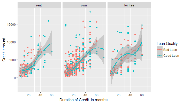
Here is the definition of theme_gray theme, straight from ggplot2's source code:
1theme_gray <- function(base_size = 12) {
2  structure(list(
3    axis.line =         theme_blank(),
4    axis.text.x =       theme_text(size = base_size * 0.8 , lineheight = 0.9, colour = "grey50", vjust = 1),
5    axis.text.y =       theme_text(size = base_size * 0.8, lineheight = 0.9, colour = "grey50", hjust = 1),
6    axis.ticks =        theme_segment(colour = "grey50"),
7    axis.title.x =      theme_text(size = base_size, vjust = 0.5),
8    axis.title.y =      theme_text(size = base_size, angle = 90, vjust = 0.5),
9    axis.ticks.length = unit(0.15, "cm"),
10    axis.ticks.margin = unit(0.1, "cm"),
11    legend.background = theme_rect(colour="white"),
12    legend.key =        theme_rect(fill = "grey95", colour = "white"),
13    legend.key.size =   unit(1.2, "lines"),
14    legend.text =       theme_text(size = base_size * 0.8),
15    legend.title =      theme_text(size = base_size * 0.8, face = "bold", hjust = 0),
16    legend.position =   "right",
17    panel.background =  theme_rect(fill = "grey90", colour = NA),
18    panel.border =      theme_blank(),
19    panel.grid.major =  theme_line(colour = "white"),
20    panel.grid.minor =  theme_line(colour = "grey95", size = 0.25),
21    panel.margin =      unit(0.25, "lines"),
22    strip.background =  theme_rect(fill = "grey80", colour = NA),
23    strip.text.x =      theme_text(size = base_size * 0.8),
24    strip.text.y =      theme_text(size = base_size * 0.8, angle = -90),
25    plot.background =   theme_rect(colour = NA, fill = "white"),
26    plot.title =        theme_text(size = base_size * 1.2),
27    plot.margin =       unit(c(1, 1, 0.5, 0.5), "lines")
28  ), class = "options")}
29
Use a built-in Theme
We can use another built-in theme by adding the theme name to the plot function using a + sign.
The theme_bw() function produces a mostly (but not entirely) black-and-white theme.
1g <- ggplot(df,aes(x=Duration.of.Credit..in.months.,y=Credit.amount,color=Loan.Quality))
2g+geom_point()+geom_smooth()+facet_wrap(~Type.of.housing)+theme_bw()
3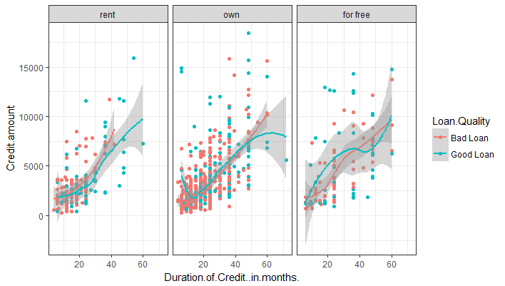
Modify/Override specific elements of the chosen theme
We can use the default theme or another built-in theme and then override some elements of it using the theme() function.
The visual elements can be classified as one of the three different types:
- Text
- Line
- Rectangle
Each type can be modified by calling the appropriate function, namely, element_text(), element_line() and element_rect().
Let's take a few examples to understand how this works.
Change Plot Background to Light Yellow
By default, the entire plot has a white background. We will change to to light green color. The background color of the plot is defined by plot.background() in the default function. The background is a part of the rectangle shape, so we can modify it using the element_rect() function. We will change the background color to light yellow and add a gray border of size 2.
1g <- ggplot(df,aes(x=Duration.of.Credit..in.months.,y=Credit.amount,color=Loan.Quality))
2plot<-g+geom_point()+geom_smooth()+facet_wrap(~Type.of.housing)
3plot+theme(plot.background = element_rect(fill = "#FFF6B0",color = "#737373", size = 2))
4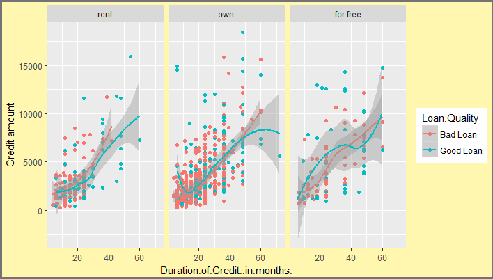
Change Axis Line and Tick Color
The plot lines can be modified using the element_line() function. Take a look at the default theme function above. The axis lines are axis.line and axis ticks are defined with axis.ticks. Also notice that the panels have a grid which is defined by panel.grid. We will remove the grids by using element_blank().
1plot+theme(plot.background = element_rect(fill = "#FFF6B0",color = "#737373", size = 2),
2           panel.grid = element_blank(),
3           axis.line = element_line(color = "#FF7E42"),
4           axis.ticks = element_line(color = "#FF7E42")
5           )
6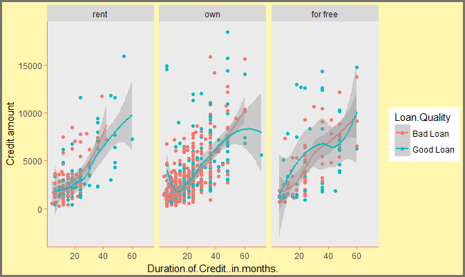
Remove Panel and Legend Backgrounds
We will now go a step further and remove the backgrounds of the panels and the legends as shown below:
1g <- ggplot(df,aes(x=Duration.of.Credit..in.months.,y=Credit.amount,color=Loan.Quality))
2plot<-g+geom_point()+geom_smooth()+facet_wrap(~Type.of.housing)
3plot+theme(plot.background = element_rect(fill = "#FFF6B0",color = "#737373", size = 2),
4           panel.grid = element_blank(),
5           axis.line = element_line(color = "#FF7E42"),
6           axis.ticks = element_line(color = "#FF7E42"),
7           panel.background = element_blank(),
8           legend.key = element_blank(),
9           legend.background=element_blank(),
10           strip.background = element_blank()
11           )
12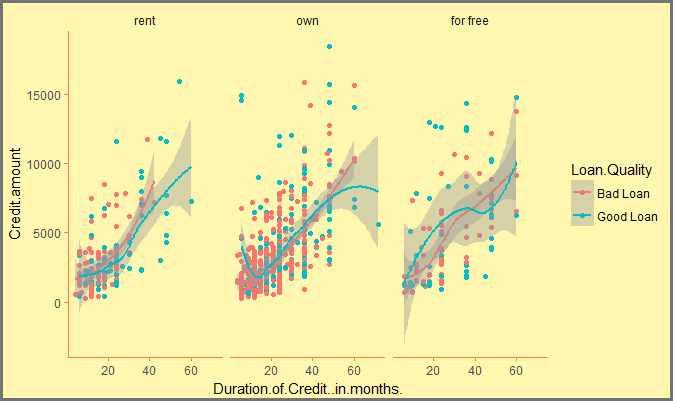
Change Text in the Chart
We can make changes to the various text elements using the element_text() function. Let's make the following changes:
- Change strip text (text that appears in panels) to pink (#E1315B) and increase their size to 16.
- Change color of x-axis and y-axis titles to blue (#008DCB) and make them italics
1plot+theme(plot.background = element_rect(fill = "#FFF6B0",color = "#737373", size = 2),
2           panel.grid = element_blank(),
3           axis.line = element_line(color = "#FF7E42"),
4           axis.ticks = element_line(color = "#FF7E42"),
5           panel.background = element_blank(),
6           legend.key = element_blank(),
7           legend.background=element_blank(),
8           strip.background = element_blank(),
9           strip.text = element_text(size = 16, color = "#E1315B"),
10           axis.title.y = element_text(color = "#008DCB", hjust = 0, face = "italic"),
11           axis.title.x = element_text(color = "#008DCB", hjust = 0, face = "italic"),
12           axis.text = element_text(color = "black")
13           )
14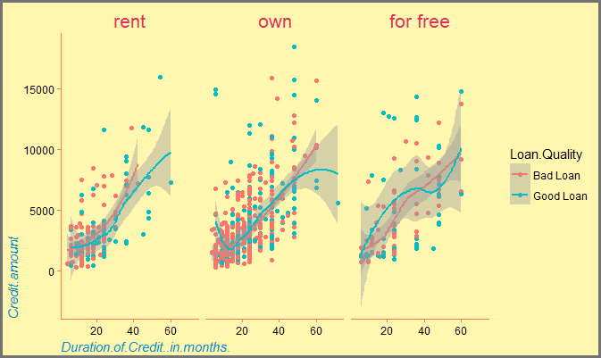
Change Legend Position
We can modify various aspects of the legend using the theme() function. In the default theme, the legend has the following properties:
1legend.background = theme_rect(colour="white"),
2    legend.key =        theme_rect(fill = "grey95", colour = "white"),
3    legend.key.size =   unit(1.2, "lines"),
4    legend.text =       theme_text(size = base_size * 0.8),
5    legend.title =      theme_text(size = base_size * 0.8, face = "bold", hjust = 0),
6    legend.position =   "right"
7
As you can see, the default position is right. The other options are 'bottom', 'left', 'top' or 'none'.
In the following example, we change the legend position to bottom.
1plot+theme(plot.background = element_rect(fill = "#FFF6B0",color = "#737373", size = 2),
2           panel.grid = element_blank(),
3           axis.line = element_line(color = "#FF7E42"),
4           axis.ticks = element_line(color = "#FF7E42"),
5           panel.background = element_blank(),
6           legend.key = element_blank(),
7           legend.background=element_blank(),
8           strip.background = element_blank(),
9           strip.text = element_text(size = 16, color = "#E1315B"),
10           axis.title.y = element_text(color = "#008DCB", hjust = 0, face = "italic"),
11           axis.title.x = element_text(color = "#008DCB", hjust = 0, face = "italic"),
12           axis.text = element_text(color = "black"),
13           legend.position = "bottom"
14           )
15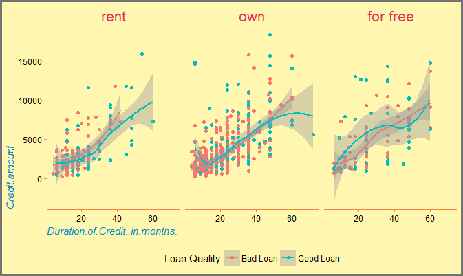
This way we can modify almost every element of the ggplot and achieve any kind of styling we want.
