• Skip to primary navigation
  • Skip to main content
  • Skip to primary sidebar
  • Skip to footer
Finance Train

Finance Train

High Quality tutorials for finance, risk, data science

  • Home
  • Data Science
  • CFA® Exam
  • PRM Exam
  • Tutorials
  • Careers
  • Products
  • Login

Adding Details and Features to R Plots

Data Science

This lesson is part 17 of 29 in the course Data Visualization with R

We’ve already seen how we can enhance the plots created in R by adding title, axis labels, legends, etc. Let’s learn about a few more enhancements.

Adding Vertical/Horizontal Lines to the Graph

You may want to add a vertical or a horizontal line to your graph at a certain axis point. This can be done using the abline() function.

> abline(v=0) # Draw a vertical line at x = 0.
> abline(h=0) # Draw a vertical line at y = 0.
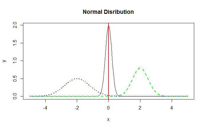
In the below example, we add a vertical line at x=0 on our normal distribution plot.

> abline(v=0,col="red",lwd=2)

The resulting graph is displayed below:

Normal Distribution – Vertical Line

Adding Explanatory text to the Visualization

To make a data visualization useful for its users, it is important to add sufficient explanatory text to it. The function text() allows us to add text anywhere inside the plotting area.

The below code adds the text “Normal Distribution Curves” to our distributions graph.

> text(-3, 1.5, "Normal Distribution Curves")
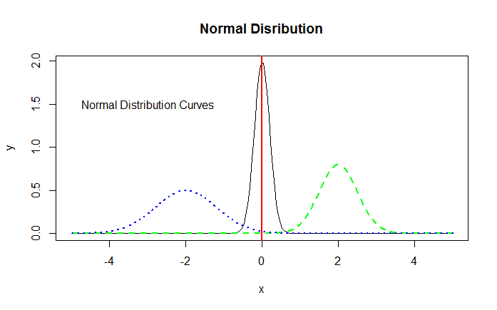
Normal Distribution – Adding Text

The text() function can be used to add text in many ways. Use the help ?text to learn more about the function.

Using Colors Effectively

While designing data visualizations, it is important to use colors to easily distinguish between various data points. For example, if you have two lines on a plot, it’s not a good idea to draw one as dark green and another as dark blue. It will be difficult to distinguish between the two lines. Iliinsky and Steele recommend a set of 12 colors, in descending order of desirability from the top of the plot to the bottom.

> # Iliinsky and Steele color name vector
> colors <- c("red", "green", "yellow", "blue", "black", "white", "pink", "cyan", "gray", "orange", "brown", "purple")
> data <- c(rep(3, 4), rep(2, 4),rep(1,4))
> barplot(rev(data), horiz = TRUE, col = rev(colors),names.arg = rev(colors), las = 1)

As you can see, we are using rep() in a function where we are creating our own sample data: rep() function replicates the values in x. For example, rep(3, 4) will repeat the value 3 4 times, i.e., 3 3 3 3. rev() function reverses an R object, including vector, array etc.

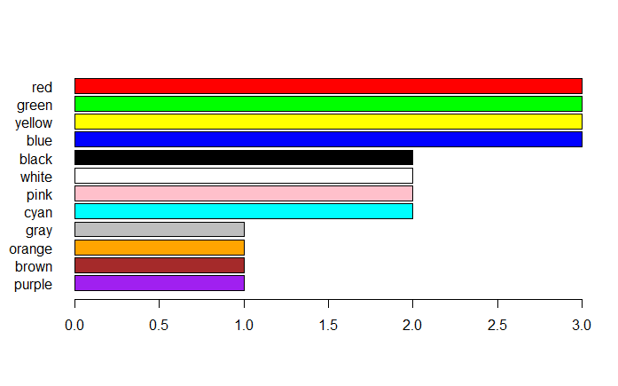
R Chart- Adding Colors

Note that in the above graph, we use the argument las=1 to rotate the plot’s axis labels. The las argument can have three possible values based on which the placement of the label will differ. With las equal to 0, the label will always be parallel to the axis (default); With las equal to 1, the label will be put horizontally. Value 2 will make it perpendicular to the axis and 3 will place it vertically.

las is actually an argument of the axis() function, that is, you can call the axis() function after the plot function to make changes to the axis. Apart from rotating the axis labels, it is capable of many things, such as changing the axis position, for example axis(3) will draw the x-axis above the plot area and axis(4) will draw the y-axis on the right side of the plot area. Note that if you want to edit the axis settings after plotting the graph using axis() function, it’s a good idea to set the default axis to false (axes=FALSE) during the initial plot creation.

Previous Lesson

‹ Plotting Multiple Datasets on One Chart in R

Next Lesson

Introduction to ggplot2 ›

Join Our Facebook Group - Finance, Risk and Data Science

Posts You May Like

How to Improve your Financial Health

CFA® Exam Overview and Guidelines (Updated for 2021)

Changing Themes (Look and Feel) in ggplot2 in R

Coordinates in ggplot2 in R

Facets for ggplot2 Charts in R (Faceting Layer)

Reader Interactions

Leave a Reply Cancel reply

Your email address will not be published. Required fields are marked *

This site uses Akismet to reduce spam. Learn how your comment data is processed.

Primary Sidebar

In this Course

  • Overview of Data Visualization
  • When to Use Bar Chart, Column Chart, and Area Chart
  • What is Line Chart and When to Use It
  • What are Pie Chart and Donut Chart and When to Use Them
  • How to Read Scatter Chart and Bubble Chart
  • What is a Box Plot and How to Read It
  • Understanding Japanese Candlestick Charts and OHLC Charts
  • Understanding Treemap, Heatmap and Other Map Charts
  • Visualization in Data Science
  • Graphic Systems in R
  • Accessing Built-in Datasets in R
  • How to Create a Scatter Plot in R
  • Create a Scatter Plot in R with Multiple Groups
  • Creating a Bar Chart in R
  • Creating a Line Chart in R
  • Plotting Multiple Datasets on One Chart in R
  • Adding Details and Features to R Plots
  • Introduction to ggplot2
  • Grammar of Graphics in ggplot
  • Data Import and Basic Manipulation in R – German Credit Dataset
  • Create ggplot Graph with German Credit Data in R
  • Splitting Plots with Facets in ggplots
  • ggplot2 – Chart Aesthetics and Position Adjustments in R
  • Creating a Line Chart in ggplot 2 in R
  • Add a Statistical Layer on Line Chart in ggplot2
  • stat_summary for Statistical Summary in ggplot2 R
  • Facets for ggplot2 Charts in R (Faceting Layer)
  • Coordinates in ggplot2 in R
  • Changing Themes (Look and Feel) in ggplot2 in R

Latest Tutorials

    • Data Visualization with R
    • Derivatives with R
    • Machine Learning in Finance Using Python
    • Credit Risk Modelling in R
    • Quantitative Trading Strategies in R
    • Financial Time Series Analysis in R
    • VaR Mapping
    • Option Valuation
    • Financial Reporting Standards
    • Fraud
Facebook Group

Membership

Unlock full access to Finance Train and see the entire library of member-only content and resources.

Subscribe

Footer

Recent Posts

  • How to Improve your Financial Health
  • CFA® Exam Overview and Guidelines (Updated for 2021)
  • Changing Themes (Look and Feel) in ggplot2 in R
  • Coordinates in ggplot2 in R
  • Facets for ggplot2 Charts in R (Faceting Layer)

Products

  • Level I Authority for CFA® Exam
  • CFA Level I Practice Questions
  • CFA Level I Mock Exam
  • Level II Question Bank for CFA® Exam
  • PRM Exam 1 Practice Question Bank
  • All Products

Quick Links

  • Privacy Policy
  • Contact Us

CFA Institute does not endorse, promote or warrant the accuracy or quality of Finance Train. CFA® and Chartered Financial Analyst® are registered trademarks owned by CFA Institute.

Copyright © 2021 Finance Train. All rights reserved.

  • About Us
  • Privacy Policy
  • Contact Us