Add a Statistical Layer on Line Chart in ggplot2
R has become very popular not just because of its data visualization capabilities but also its ability to combine data visualizations with statistical information. The statistics layer helps us represent statistical information about the data, such as mean and variance, to help in understanding the data.
We earlier learned about geoms which stand for "geometric objects." These are the core elements that you see on the plot, and includes objects such as points, lines, areas, and curves. Stats stand for "statistical transformations." These help us summarize the data in different ways such as counting observations, creating a linear regression line that best fits the data, or adding a confidence interval to the regression line.
All geoms have a default stat. For example, when we create a bar chart using geom_bars, the default stat is stat_count, which counts the number of rows to create the bar chart. You can add statistics layers to the plot using the stat_ functions.
| Stat | Description |
|---|---|
| bin | Divide continuous range into bins, and count number of points in each |
| boxplot | Compute statistics necessary for boxplot |
| contour | Calculate contour lines |
| density | Compute 1d density estimate |
| identity | Identity transformation,f(x)=x |
| jitter | Jitter values by adding small random value |
| Calculate values for quantile-quantile plot | |
| quantile | Quantile regression |
| smooth | Smoothed conditional mean of y given x |
| summary | Aggregate values of y for given x |
| unique | Remove duplicated observations |
Let's look at some of these statistics.
Smoothing
One of the most common statistical transformations we add to our plots is a smoothing line. When we plot a scatter chart, we can add a smoothing line using the geom_smooth(), which in turn uses stat_smooth to plot the smooth curve.
Let's use our stock_prices dataset and create a scatter plot with AAPL prices on x-axis and GOOGL prices on y-axis. We will add a smooth line to the scatter plot (LOESS is the default) with geom_smooth().
1ggplot(stock_prices,aes(x=AAPL,y=GOOGL))+
2  geom_point()+
3  geom_smooth()
4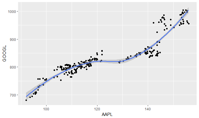
We will now change the smoothing to linear model. The default formula is y ~ x. We change the model by specifying method="lm".
1ggplot(stock_prices,aes(x=AAPL,y=GOOGL))+
2  geom_point()+
3  geom_smooth(method="lm")
4
The smoothing line shows 95% confidence interval bands by default. We can hide the bands by adding the argument se=FALSE.
1ggplot(stock_prices,aes(x=AAPL,y=GOOGL))+
2  geom_point()+
3  geom_smooth(method="lm",se=FALSE)
4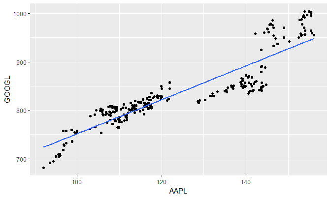
Suppose we wanted to plot just the model and not the actual points. we can do so using geom_smooth() or stat_smooth()
1ggplot(stock_prices,aes(x=AAPL,y=GOOGL))+
2  stat_smooth(method="lm",se=FALSE)
3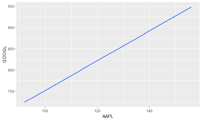
Modifying stat_smooth
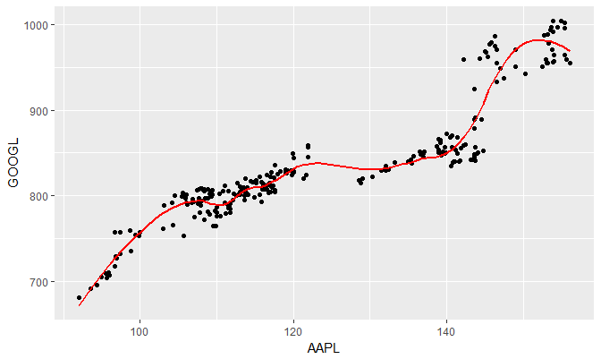
We can modify various aspects of stat_smooth. For example, span can be used to control the amount of smoothing for the default loess smoother. Smaller numbers produce wigglier lines, larger numbers produce smoother lines.
In the following example, we set the span to 0.3 and also change the line color to red.
1ggplot(stock_prices,aes(x=AAPL,y=GOOGL))+
2  geom_point()+
3  stat_smooth(se=FALSE,col="red",span=0.3)
4