Creating a Line Chart in ggplot 2 in R
Apart from scatter and bar charts, another popular type of chart that is frequently used in financial analysis is the line chart. In this lesson we will learn about how to create a line chart using ggplot2.
Line charts are best suited for time-series data with time/date on the x-axis and some metrics or data on the y-axis. For our example, we will use stock prices data.
Import Data
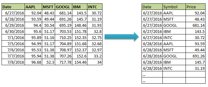
We have created a CSV file that contains the daily stock prices of the top 5 tech stocks in the US for the past 1 year.
Let's first import the data into R as a data frame (called stock_prices). We can inspect the data frame using the str() function.
1> stock_prices <-read.csv("stock_data.csv")
2> str(stock_prices)
3'data.frame':    251 obs. of  6 variables:
4 $ Date : Factor w/ 251 levels "1/10/2017","1/11/2017",..: 179 180 181 182 188 204 205 206 207 189 ...
5 $ AAPL : num  92 93.6 94.4 95.6 95.9 ...
6 $ MSFT : num  48.4 49.4 50.5 51.2 51.2 ...
7 $ GOOGL: num  681 691 695 704 710 ...
8 $ IBM  : num  144 146 148 152 152 ...
9 $ INTC : num  30.7 31.2 31.9 32.8 32.8 ...
10>
11
One problem with the above data is that the data in date field is taken as Factors instead of Dates. Before proceeding, we will convert this field into a date field.
1> stock_prices$Date<-as.Date(as.character(stock_prices$Date), format = '%m/%d/%Y')
2> str(stock_prices)
3'data.frame':    251 obs. of  6 variables:
4 $ Date : Date, format: "2016-06-27" "2016-06-28" ...
5 $ AAPL : num  92 93.6 94.4 95.6 95.9 ...
6 $ MSFT : num  48.4 49.4 50.5 51.2 51.2 ...
7 $ GOOGL: num  681 691 695 704 710 ...
8 $ IBM  : num  144 146 148 152 152 ...
9 $ INTC : num  30.7 31.2 31.9 32.8 32.8 ...
10>
11
Now you can see that the format for the Date variable is Date.
Simple Line Chart
Let's plot our first line chart with date on x-axis and Apple stock prices on y-axis.
1ggplot(stock_prices, aes(x = Date, y = AAPL)) +
2  geom_line()
3
ggplot will automatically adjust both x and y-axis scales according to the data.
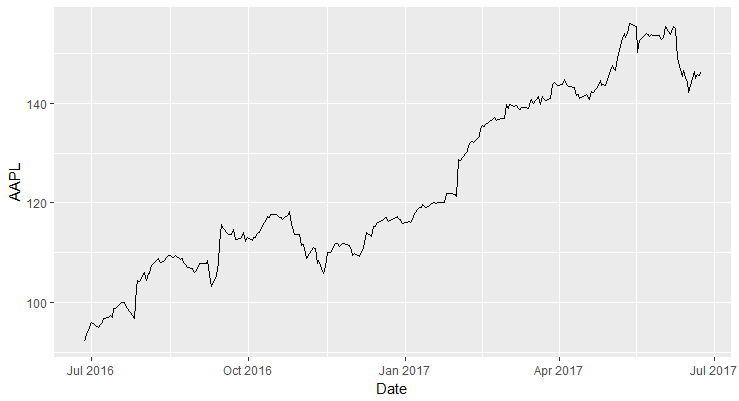
Line Chart in ggplot2
Customizing Line Aesthetics
You can customize various aspects of a line in the plot such as the line width, line color, and line type.
linetype: This parameter specifies the line type. The common options are "solid", "dashed", "dotted", "dotdash", "longdash", "twodash".size: This parameter specifies the thinkness of the line specified as a number. Default is 0.colour: This parameter is used to specify the color of the line.
In the following code, we change the linetype to dashed, increase the size to 1, and the colour of the line to blue.
1ggplot(stock_prices, aes(x = Date, y = AAPL)) +
2  geom_line(colour="blue", linetype="dashed", size=1)
3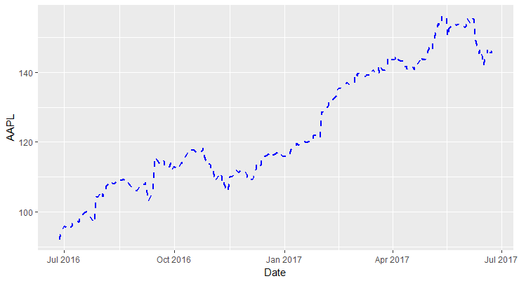
Plotting Multiple Lines (Cleaning Data)
Let's say we want to plot the prices of all the stocks in a single plot with each line representing one stock. One way to do this is to use geom_line() multiple times to add each additional line.
1ggplot(stock_prices, aes(x = Date, y = AAPL)) +
2  geom_line()+
3  geom_line(aes(x = Date, y = GOOGL))
4
However, this is not the correct method.
The correct way to handle this scenario is to convert the data into long form. This is also called tidy data where each column is a variable and each row is an observation. In our example data, we would want to have a separate column called 'Symbol' which will hold the stock symbol, and a new column called Price which will hold the price for that symbol.
Once we have data in this format, we can plot the line chart and group the data by Symbol to split it into multiple lines.
To convert the data into long-form, we can use the tidyr package. (We will have an elaborate course on cleaning data in R).
1#install and load tidyr package
2install.packages("tidyverse")
3library(tidyr)
4
tidyverse installs many packages related to cleaning data.
We use the gather() function of the tidyr package to move data from stock_prices dataframe to a new dataframe called stock_prices.tidy. This data frame should have three columns: Date, Symbol and Prices.
gather() takes four arguments: the original data frame (stock_prices), the key column (Symbol), the value column (Prices) and the name of the grouping variable with a minus in front (-Date).
1> stock_prices.tidy <- gather(stock_prices,Symbol, Prices, -Date)
2
You can now inspect the dataframe.
1> str(stock_prices.tidy)
2'data.frame':    1255 obs. of  3 variables:
3 $ Date  : Date, format: "2016-06-27" ...
4 $ Symbol: chr  "AAPL" "AAPL" "AAPL" "AAPL" ...
5 $ Prices: num  92 93.6 94.4 95.6 95.9 ...
6
Plotting Multiple Lines
We can now easily plot multiple lines with this new dataframe.
1ggplot(stock_prices.tidy, aes(x = Date, y = Prices,color = Symbol)) +
2  geom_line()
3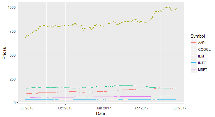
Subsetting Data
Let's say we don't want to exclude GOOGL data from the plot. To do so, we can subset the data using the subset function and store the resulting dataset in a new data frame. Then we can use the new data frame to create the line chart.
1newdata <- subset(stock_prices.tidy,Symbol!='GOOGL')
2ggplot(newdata, aes(x = Date, y = Prices,color = Symbol)) +
3  geom_line(size=1)
4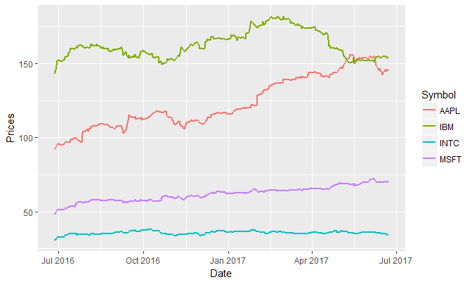
Note about Dates: In the as.Date() function, the format specifies the format of the input. In this example, the date in the CSV file is structured as "1/10/2017","1/11/2017", i.e., Month, Day and the Year. That's why the format is specified as %m/%d/%y. The output of the as.Date() function is the date, which is printed as 2016/10/12 (YYYY/MM/DD)
