- Overview of Data Visualization
- When to Use Bar Chart, Column Chart, and Area Chart
- What is Line Chart and When to Use It
- What are Pie Chart and Donut Chart and When to Use Them
- How to Read Scatter Chart and Bubble Chart
- What is a Box Plot and How to Read It
- Understanding Japanese Candlestick Charts and OHLC Charts
- Understanding Treemap, Heatmap and Other Map Charts
- Visualization in Data Science
- Graphic Systems in R
- Accessing Built-in Datasets in R
- How to Create a Scatter Plot in R
- Create a Scatter Plot in R with Multiple Groups
- Creating a Bar Chart in R
- Creating a Line Chart in R
- Plotting Multiple Datasets on One Chart in R
- Adding Details and Features to R Plots
- Introduction to ggplot2
- Grammar of Graphics in ggplot
- Data Import and Basic Manipulation in R - German Credit Dataset
- Create ggplot Graph with German Credit Data in R
- Splitting Plots with Facets in ggplots
- ggplot2 - Chart Aesthetics and Position Adjustments in R
- Creating a Line Chart in ggplot 2 in R
- Add a Statistical Layer on Line Chart in ggplot2
- stat_summary for Statistical Summary in ggplot2 R
- Facets for ggplot2 Charts in R (Faceting Layer)
- Coordinates in ggplot2 in R
- Changing Themes (Look and Feel) in ggplot2 in R
Coordinates in ggplot2 in R
The coordinate system of a plot refers to the space on which the data is plotted. The coordinate system of a plot, together with the x and y position scale, determines the location of geoms.
Below are the available coordinate options:
coord_cartesian: This is the default coordinate system (x horizontal from left to right, y vertical from bottom to top)coord_flip: Flipped cartesian coordinate system (x vertical from bottom to top, y horizontal from left to right)coord_trans: Used to to transform the coordinate system. We, i.e., substitute traditional axes with logarithmic axes and then present the values and statisticscoord_equal: Ensures the units are equally scaled on the x-axis and on the y-axiscoord_polar: Polar coordinate system; the x (or y) scale is mapped to the angle (theta)coord_map: Various map projections
Most popular graphs such as line and bar charts are drawn using Cartesian coordinates.
coord_cartesian
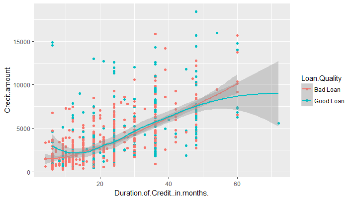
When we plot a chart, Cartesian Coordinates is the default coordinate system. For example, the following chart plots Duration of Credit on x-axis and Credit Amount on y-axis. The points are colors by the factor Loan.Quality.
g <- ggplot(df,aes(x=Duration.of.Credit..in.months.,y=Credit.amount,color=Loan.Quality))
g+geom_point()+geom_smooth()+coord_cartesian()
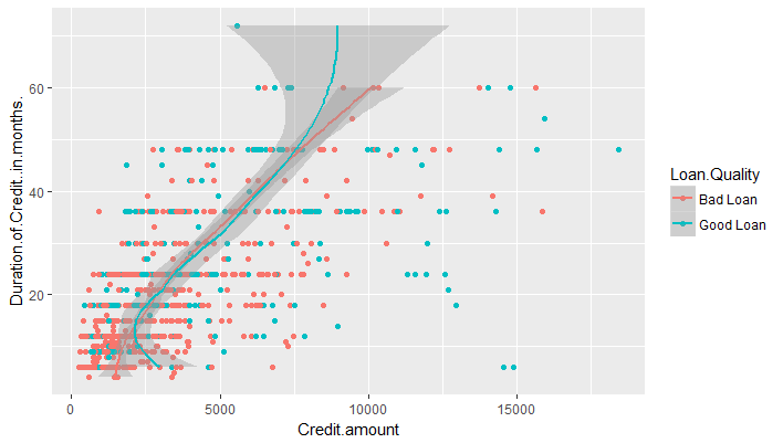
coord_flip
By specifying coord_flip, it will still use the cartesian system, but flip the two axis.
g <- ggplot(df,aes(x=Duration.of.Credit..in.months.,y=Credit.amount,color=Loan.Quality))
g+geom_point()+geom_smooth()+coord_flip()
Zooming In
We can use the coordinates layer to zoom in to a plot by setting limits. The various options are below:
coord_cartesian(xlim = NULL, ylim = NULL, expand = TRUE)
xlim, ylim: Limits for the x and y axes.expand: If TRUE, the default, adds a small expansion factor to the limits to ensure that data and axes don't overlap. If FALSE, limits are taken exactly from the data or xlim/ylim
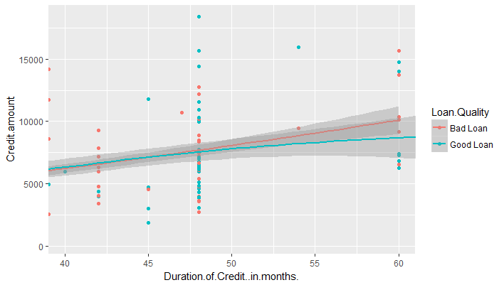
Let's say we want to zoom in our plot to show the points where the Duration of credit is between 40 and 60. This can be done as follows:
g <- ggplot(df,aes(x=Duration.of.Credit..in.months.,y=Credit.amount,color=Loan.Quality))
g+geom_point()+geom_smooth()+coord_cartesian(c(40,60))
Aspect Ratio
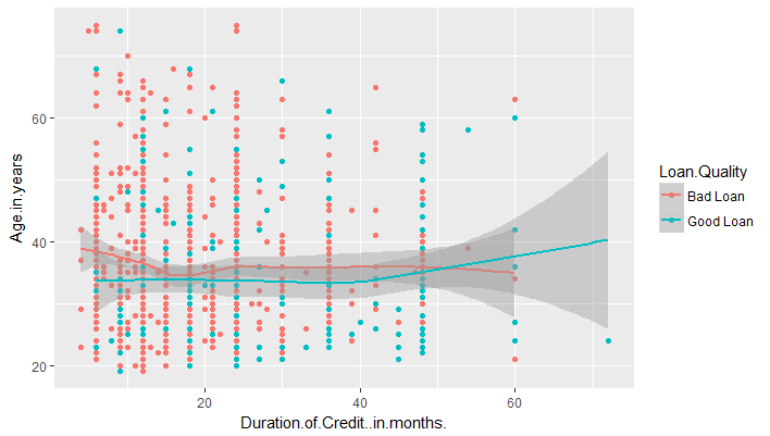
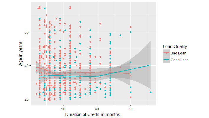
We can set the aspect ratio of a plot with coord_fixed() or coord_equal(). Both use aspect = 1 (1:1) as a default. For example, consider the following plot which plots Duration of Credit on x-axis and Age on y-axis.
g <- ggplot(df,aes(x=Duration.of.Credit..in.months.,y=Age.in.years,color=Loan.Quality))
g+geom_point()+geom_smooth()
We can add the coordinate coord_equal() to make the aspect ratio 1:1.
g <- ggplot(df,aes(x=Duration.of.Credit..in.months.,y=Age.in.years,color=Loan.Quality))
g+geom_point()+geom_smooth()+coord_equal()
Related Downloads
Free Guides - Getting Started with R and Python
Enter your name and email address below and we will email you the guides for R programming and Python.