- Overview of Data Visualization
- When to Use Bar Chart, Column Chart, and Area Chart
- What is Line Chart and When to Use It
- What are Pie Chart and Donut Chart and When to Use Them
- How to Read Scatter Chart and Bubble Chart
- What is a Box Plot and How to Read It
- Understanding Japanese Candlestick Charts and OHLC Charts
- Understanding Treemap, Heatmap and Other Map Charts
- Visualization in Data Science
- Graphic Systems in R
- Accessing Built-in Datasets in R
- How to Create a Scatter Plot in R
- Create a Scatter Plot in R with Multiple Groups
- Creating a Bar Chart in R
- Creating a Line Chart in R
- Plotting Multiple Datasets on One Chart in R
- Adding Details and Features to R Plots
- Introduction to ggplot2
- Grammar of Graphics in ggplot
- Data Import and Basic Manipulation in R - German Credit Dataset
- Create ggplot Graph with German Credit Data in R
- Splitting Plots with Facets in ggplots
- ggplot2 - Chart Aesthetics and Position Adjustments in R
- Creating a Line Chart in ggplot 2 in R
- Add a Statistical Layer on Line Chart in ggplot2
- stat_summary for Statistical Summary in ggplot2 R
- Facets for ggplot2 Charts in R (Faceting Layer)
- Coordinates in ggplot2 in R
- Changing Themes (Look and Feel) in ggplot2 in R
Creating a Bar Chart in R
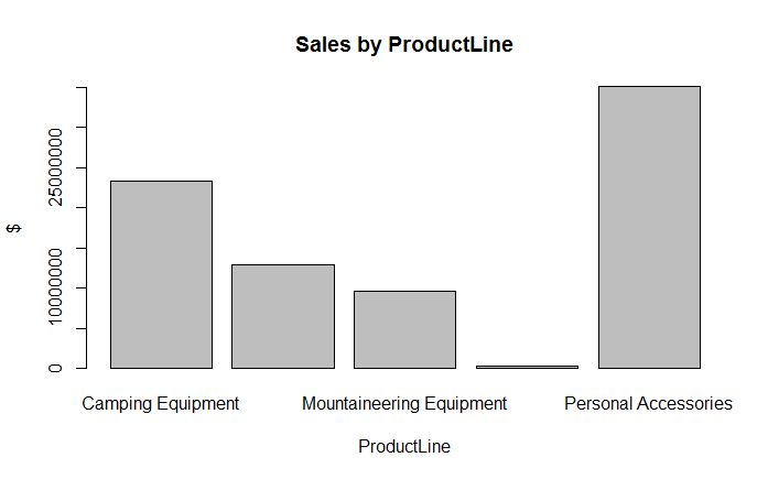
In R, we can create a bar plot using the barplot() function. A Bar Plot or Bar Graph is primarily used to compare values. It presents grouped data using rectangular bars whose lengths are proportional to the values that they represent. Let's take our Product Sales data where we have the Revenue and Gross Margin for each order along with various attributes such as ProductLine, RetailerType, OrderMethod etc. We can use this data to create a bar chart which plots the total or average sales on y-axis as bars and the x-axis as one of these factors that we are interested in such as ProductLine.
The first step is to group the Total Sales by ProductLine using the tapply() function as shown below:
> sales_by_productline <- tapply(sales$Revenue, sales$ProductLine, sum)
This gives us the sales to be plotted as bars. We can now plot the chart using the barplot() function.
> barplot(sales_by_productline)
The above function call will create the bar chart. We can enhance the chart by adding a title and axis labels.
> barplot(sales_by_productline, main="Sales by ProductLine", xlab="ProductLine",ylab="$")
The resulting bar plot is displayed below:
Adding Colors to Bars
We can add different colors to the bars in the bar plot by adding the col argument. The col argument is basically a vector of colors. R has some inbuilt functions to generate vectors of colors, for example, the gray function generates a vector of grays. Similarly the rainbow function generates a vector of rainbow colors. Alternatively you can explicitly supply a vector containing color codes. In the following example, we extend our bar plot by painting the bars with rainbow colors:
> barplot(sales_by_productline, col=rainbow(5), main="Sales by ProductLine", xlab="ProductLine",ylab="$")
The graph will now look as follows:
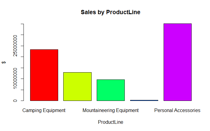
To supply explicit colors, you would pass the col argument as col = c("Red", "Green", "Blue", ...). Alternatively, you can also specify the hex codes for the colors.
The base graphics library provides only basic features for plotting charts. For example, in the above bar chart, we could have plotted mean revenue values instead of totals. That would have worked fine. However, suppose we also wanted to plot max and min sales for each product line as markers above and below the mean bars. That would be very complicated to achieve here. However, the same thing could be easily done with other plotting libraries such as gplots. We will learn about the gplots library in a separate course.
Exercise
- Load the Product Sales data in your R environment
- Create a bar plot containing the Average Gross Margin, grouped by RetailerType
- Color by bars with various shades of gray according to their rank, shorter bars being lighter colors and taller bars being darker colors.
Related Downloads
Free Guides - Getting Started with R and Python
Enter your name and email address below and we will email you the guides for R programming and Python.