Lessons
- Descriptive Vs. Inferential Statistics
- Types of Measurement Scales
- Parameter, Sample Statistic, and Frequency Distribution
- Relative Frequencies and Cumulative Relative Frequencies
- Properties of a Data Set (Histogram / Frequency Polygon)
- Measures of Central Tendency
- Calculating Arithmetic Mean
- Calculating Weighted Average Mean
- Calculating Geometric Mean
- Calculating Harmonic Mean
- Calculating Median and Mode of a Data Set
- Quartiles, Quintiles, Deciles, and Percentiles
- Range and Mean Absolute Deviation
- Variance and Standard Deviation
- Chebyshev’s Inequality
- Coefficient of Variation
- Sharpe Ratio
- Skewness and Kurtosis
- Relative Locations of Mean, Median and Mode
Properties of a Data Set (Histogram / Frequency Polygon)
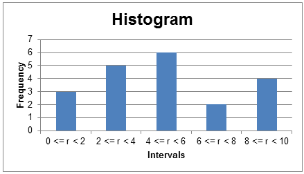
Histogram
The data in a frequency distribution can be presented using a histogram. A histogram is a bar chart with different intervals on the X-axis and the absolute frequencies on the Y-axis. The histogram for our data is presented below:
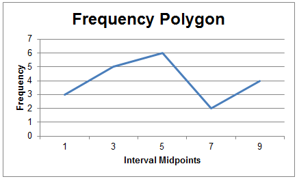
Frequency Polygon
A frequency polygon is similar to a histogram, except that the x-axis plots the mid-point for each interval. Instead of bars, the neighbouring points are connected by lines.
The interval mid points for our frequency intervals are 1, 3, 5, 7, and 9. The frequency polygon will look as follows:
Related Downloads
Related Quizzes
Finance Train Premium
Accelerate your finance career with cutting-edge data skills.
Join Finance Train Premium for unlimited access to a growing library of ebooks, projects and code examples covering financial modeling, data analysis, data science, machine learning, algorithmic trading strategies, and more applied to real-world finance scenarios.
I WANT TO JOINJOIN 30,000 DATA PROFESSIONALS
Free Guides - Getting Started with R and Python
Enter your name and email address below and we will email you the guides for R programming and Python.